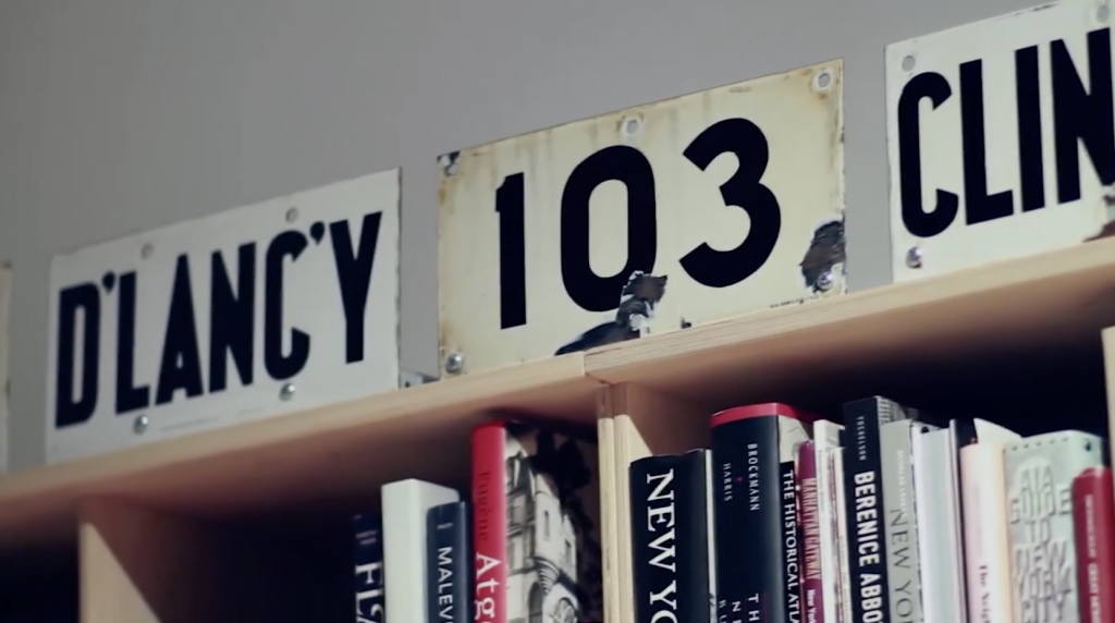
A highlight of 2013, this video was part to a presentation of the AIGA 2013 Medal awards for which Jonathan Hoefler and Tobias Frere-Jones were awarded.
From H&FJ’s original post:
In addition to offering an intimate look at two recent works-in-progress, and a tour of H&FJ’s offices in a rare moment of repose, this startling exposé reveals for the first time what ongoing dispute provokes the greatest disagreement between H and FJ. (Hint: this sentence contains five of them.)

_salisae_
My color teacher insisted that the higher the crossbar on someone’s written lowercase t, the more confident they were. Is this where the bone of contention lies?
theorosendorf
Haha! H&FJ has no shortage of confidence. Crossbars are normally aligned to the x‑height. It’s the height of the stem they’re referring to. See here http://ilovetypography.com/2009/01/14/inconspicuous-vertical-metrics/
_salisae_
I was guessing at the conflict in hopes of finding out what it was, but brushing up on my typography language is probably a better idea. 😉 Nice video. I love your work!
theorosendorf
Thanks @salisae:disqus !
I should clarify though, I had nothing to do with that great video.