

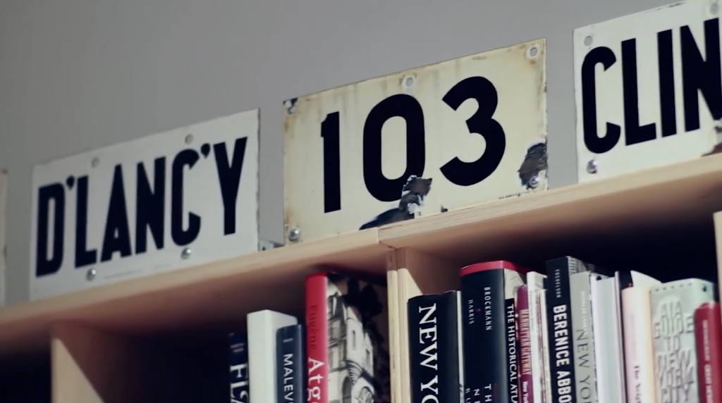
Posters for Migrants
For the holidays and into 2019, we are donating half of our poster sales to support Central American migrants seeking asylum in the United States — AKA the “Migrant Caravan.”

Grafica Della Strada, The Signs Of Italy
It starts with a 16 year old Louise Fili traveling to Italy, stepping off the plane, and falling in love with a billboard. That moment marked the start of Fili’s typographic obsession, and budding career in graphic design. (more…)

Type Rules! 4th Edition
The latest edition of Type Rules! is on the shelves and it was worth the wait. (more…)

The Old Printing Office
The Old Printing Office by Frank Luther Mott is an account of Mott as a printer’s devil for his father’s small town weekly papers in Iowa.

Book Life
It is amazing just how much text exists on the internet. More amazing still is the sheer amount of text that is unavailable.
Inside the office of Hoefler & Frere-Jones
A highlight of 2013, this video was part to a presentation of the AIGA 2013 Medal awards for which Jonathan Hoefler and Tobias Frere-Jones were awarded.

The Curious Misconception Surrounding Sentence Spacing
There’s a widespread misconception that “proper” English requires two word spaces after a sentence.

John Fuller’s Sycamore Press
Ryan Roberts, purveyor of the official websites for Julian Barnes, Ian McEwan, James Fenton, Hermione Lee, and Ian Hamilton, has authored “John Fuller and the Sycamore Press: a bibliographic history.”

Typography Deconstructed Letterpress Poster
From Drew Binkley comes the Typography Deconstructed Letterpress Poster, printed by Studio on Fire on 16″ x 24″ Crane Lettra Pearl paper.

Chicago Manual of Style, 16th Edition
In 1906, a small university press in Chicago published its standardized typographical practices.
Typographic Train Wrecks
You’re in a store searching for that perfect picture frame. You pick one up that looks good—a simple wood frame with just enough detail to complement your photo.

John Rodker’s Ovid Press
Gerald W. Cloud, author of John Rodker’s Ovid Press: A Bibliographical History, is an investigator with a bent for narrative writing about books.

A Poster for São Paulo
Celebrating the 457th anniversary of São Paulo, the designer Paulo Moretto, along with Alécio Rossi created the exhibit “A Poster for São Paulo”.

Detail in Typography by Jost Hochuli
Hands down, Hyphen Press has the best typeset and thoughtfully bound books on type.

Dala Floda by Paul Barnes
Dala Floda started out in 2005 as a headline typeface for Frieze Magazine. It has since grown and is now available as a full-featured family of 12 styles.

50 Reading Lists for Designers
“Spin/2 – 50 Reading Lists, a paper based on asking major figures in graphic design the question: what are the top ten books that you believe designers should read?”

Hart’s Rules for Compositors and Readers
From 1967 and a great resource for info on setting type. An updated version is also available: Hart’s Rules for Compositors and Readers.
The WSJ Hedcuts by Randy Glass
Everyone has seen his work. Master stippler Randy Glass has created hundreds of these hedcut style illustrations for the Wall Street Journal.

Sachsenwald Blackletter
“This typeface was designed by Bertold Wolpe in Germany in the early 1930s and was originally named Bismarck Schrift…”

Supergraphics from Unit Editions
Supergraphics just arrive at my desk. Unit Editions has a knack for superlative documentation of creative objects…

Gary Anderson, Designer of ♻
“It has been called one of America’s “most important design icons,” it is one of the most recognizable graphic symbols in the world and has helped to encourage global recycling. In some countries, such as the UK, the symbol carries such implicit meaning that it requires government permission to...
Read More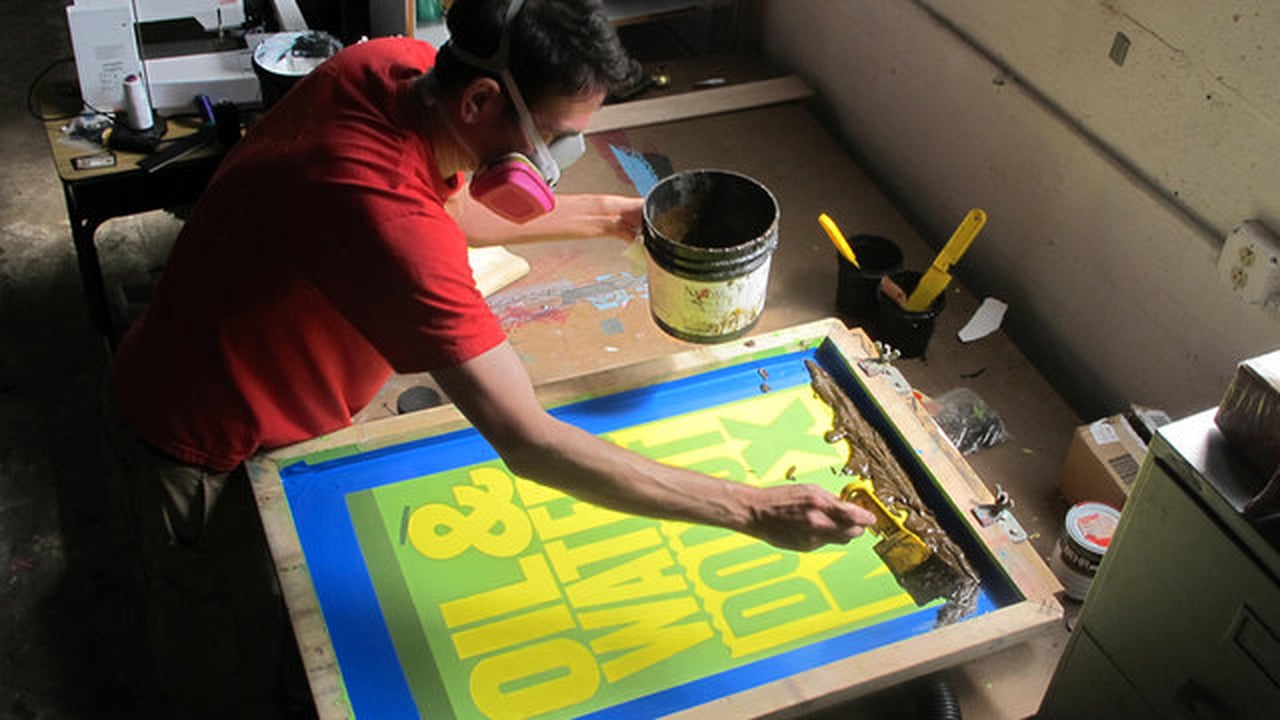

Nijhof & Lee: Amsterdam’s Best Bookstore
No graphic designer or typophile should miss a trip to Nijhof & Lee.


An interview with Theo Rosendorf at Herman Miller’s Lifework Blog
“Is there any piece of home office furniture you most enjoy? My Eames Soft Pad Group Executive chair. I’ve had it for ten years and it just gets better with age. It doesn’t wear out, it wears in.”


Unit Editions Makes Books for Designers
From Adrian Shaughnessy and Tony Brook comes Unit Editions, a south London publishing company producing books on design and visual culture. I talked with Adrian Shaughnessy to get up to speed with what’s in store at Unit Editions.
Monocle Magazine Picks The Typographic Desk Reference as a Vital Life Improvement
The Typographic Desk Reference is one of Monocle Magazine’s Autumn picks of vital life improvements.
TDR Site Listed at Moluv
Moluv.com lists The Typographic Desk Reference website as one of the world’s best looking websites…
TDR Makes abduzeedo Site of the Week
abduzeedo: Abducted by Design chose the Typographic Desk Reference website as one of their sites of the week.
TDR at The TDC in NYC
I’ll be signing copies of The Typographic Desk Reference at the inaugural Type Directors Club Book Fair May 29th – 30th…
Type Geek Space Craft
I’ll be speaking about setting type and some finer points of proportion and space next Thursday April 29th at the Atlanta Web Design Group meeting…

Mississippi Meanders
Beautiful examples of cartographic information design are on display at Radical Cartography. Like the sample above, my favorite are the maps designed by Harold Fisk in 1944 for the Army Corps of Engineers, showing the historical traces of the Mississippi River. Link via Apartment Therapy
How to Host an Event
The Typographic Desk Reference release party was a success. Thanks to everyone who was able to make it and to those who sent emails, texts, tweets, and voicemails in lieu…
TDR Book Release Party
Join us to celebrate the release of The Typographic Desk Reference, Friday March 20th, 5:30 – 9:00 pm at Atlanta’s (context)…
The Typographic Desk Reference Ships
The Typographic Desk Reference started shipping this week. Here are some points on how to get it shipped to you…
TDR Site Makes 2009 Web Trends List
The Typographic Desk Reference website makes Smashing Magazine’s list of Web Design Trends For 2009…
Preview: The Typographic Desk Reference
The Typographic Desk Reference (TDR) is now available for pre-order through Oak Knoll…
Helvetica, The Movie
Helvetica is a feature-length independent film about typography, graphic design and global visual culture. The film was shot in high-definition on location in the United States, England, the Netherlands, Germany, Switzerland, France and Belgium. It is currently in post-production and is slated to begin screening at film festivals worldwide...
Read MoreUse of the ampersand & and
When is it appropriate to use an ampersand “&” instead of the word “and”?
The Double-Space Debate
So, what’s your opinion? A, B, or C? [A] Two spaces after a period is the proper way to set type. [B] With the white space above the point, one space after a period is all that’s needed. [C] The physical space after a period should be thinner to...
Read MoreTypophile Beta
The new Typophile website contains a “typowiki”. The Typophile Wiki is a “user-created encyclopedia of all things type-related. Users create and edit Wiki entries with the aim of becoming a collaborative, useful and relevant resource.”

Read Regular
Designed to assist dyslexic readers, Read Regular is a typeface designed by Dutch designer Natascha Frensch. Letterforms like b and d are typically drawn as the same character and then just swapped. Read Regular differentiates these forms by making each unique.
Save the French Imprimerie Nationale heritage
Graphê, association pour la promotion de l’art typographique is petitioning to preserve the heritage of the French government printing organization.