Type Rules! 4th Edition
The latest edition of Type Rules! is on the shelves and it was worth the wait. (more…)
The typographic work of Alex Fowkes for Sony Music
Alex Fowkes designed this great mural of Sony Music’s history, illustrated with mostly type.
The Old Printing Office
The Old Printing Office by Frank Luther Mott is an account of Mott as a printer’s devil for his father’s small town weekly papers in Iowa.
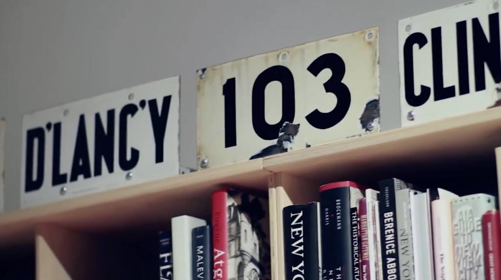
Inside the office of Hoefler & Frere-Jones
A highlight of 2013, this video was part to a presentation of the AIGA 2013 Medal awards for which Jonathan Hoefler and Tobias Frere-Jones were awarded.
Bodoni’s Manuale Tipografico (1818) is Online
A copy of Giambattista Bodoni’s Manuale Tipografico has been photographed and posted by the Rare Book Room.
Best Alternative to Helvetica
Font Shop just released a Best Fonts of 2010 list where Bruno Maag’s Aktiv Grotesk is coined the “Best Alternative for Helvetica.”
Erik Spiekermann on Deutsche Welle TV
On the heels of having won the Federal German Design Prize 2011 Lifetime Achievement Award from the German Design Council, Erik Spiekermann is interviewed by Deutsche Welle TV.
Making Grids with Sigurður Ármannsson’s Easy Grid Calculator
Sigurður Ármannsson explains how to use his Easy Grid Calculator to produce square document grid units based on leading.
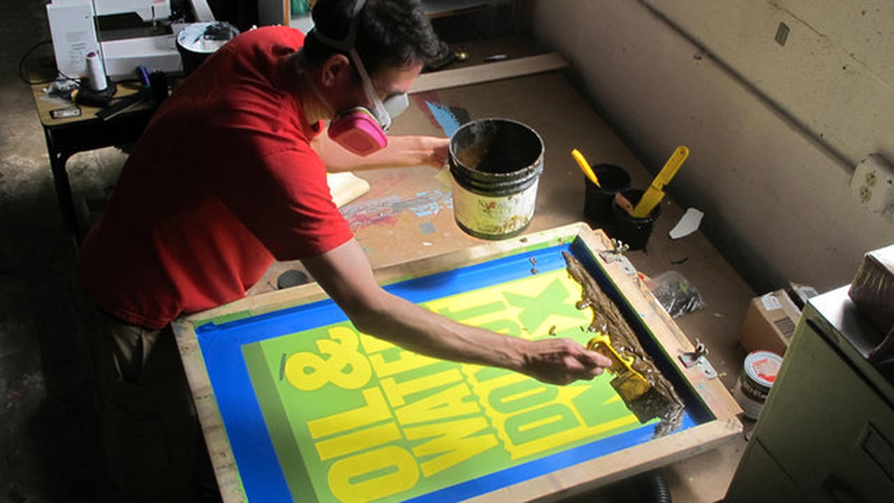
Hand Drawn Type
Most people are surprised to find how much type isn’t set with fonts on the computer but hand drawn. This is usually the case with most old signs and billboards, made when type didn’t exist or just wasn’t easily accessible. Typography Served has posted a few nice examples of...
Read MoreMafra Display by Pedro Leal
Mafra was published by dstype in 2010. Soon to be available at MyFonts and other places.
Colophon’s Aperçu
Brighton based designers Anthony Sheret and Edd Harrington have recently launched their specimen catalogue to accompany the release of Aperçu, the latest font to come out of their font foundry, Colophon.
Nijhof & Lee: Amsterdam’s Best Bookstore
No graphic designer or typophile should miss a trip to Nijhof & Lee.
Rob Janoff on the Design of the Apple Logo
Ivan Raszl interviews Rob Janoff, the original designer of the Apple logo…
I’m Combining Subscription Lists for my Book (The Typographic Desk Reference) and Type Desk
Due to the growing complexity of managing multiple subscription lists, I’ve decided to combine the lists for my book (The Typographic Desk Reference) and Type Desk…
Type Geek Space Craft
I’ll be speaking about setting type and some finer points of proportion and space next Thursday April 29th at the Atlanta Web Design Group meeting…
e‑books vs paper, what’s your take?
Are you an old school bibliophile? Do you care what font a text is set in? Is resolution an issue? Is print dead?
e‑books vs paper, what’s your take?
Are you an old school bibliophile? Do you care what font a text is set in? Is resolution an issue? Is print dead?


