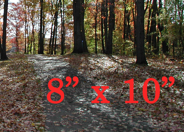
You’re in a store searching for that perfect picture frame. You pick one up that looks good—a simple wood frame with just enough detail to complement your photo.
And then you see the sample photo … with its typographic train wreck.

What’s strange about this type disaster is that the mistake is usually made in reverse. A common slip is to use straight quotation marks (dumb quotes), or even prime marks in place of typographic quotation marks. While that may be overlooked in texts and e‑mails, it’s a no-no for professional work.
In the photo frame, the opposite occurred. We see typographic quotation marks in place of prime marks. An uncommon error, but one that should be avoided as well.
Unfortunately, disasters can cause multiple casualties. This is no exception. The letter “x” should be a dimension sign, “×.” This slip is more subtle, to be sure. But these blunders are enough to make the savvy shopper wonder about the quality of the product.
Hopefully the price is right.
MOM
Beautiful article and it makes good points.
I can’t find a dimension sign on my keyboard, so I take it not every one has it, correct?
Theo Rosendorf
Anyone can type ×. It just requires some knowhow. I use a special keyboard on an Apple that’s remapped, so all I need to type is OPTION + x.
Wikipedia has more info on × http://en.wikipedia.org/wiki/×
Lima Zulu
And in less important news, people are still dying in droves around the world.
Brian
Are any of them dying because of typographical errors?
Felicity
At least it didn’t say 8 1/2 x 11.
Brandon B Hudson
Can you point me in the direction of some “real” literature on this subject. Something Uni worthy. I agree, just need reference material to support my claim.
David Spencer
Sure! “The Typographic Desk Reference,” written by the host of this website, Theo Rosendorf, features these glyphs and their definitions. Robert Bringhurst defines quotation marks, “dumb quotes,” and prime marks in his book, “The Elements of Typographic Style.” Ilene Strizver devotes almost two pages to the quotation mark discussion in the latest edition of her book “Type Rules!: The Designer’s Guide to Professional Typography” (Third Edition). You could also use James Felici’s recently released Second Edition of “The Complete Manual of Typography.” He provides some useful discussion about the quotation mark topic as well. Of course, there are other works on typography you could reference as well, both in print and online. If you’re looking for something more readily available, you can check out Web articles like Strizver’s “Top Ten Type Crimes” where she mentions this in part: http://www.fonts.com/aboutfonts/articles/finetypography/toptentypecrimes.htm
Hope this helps!