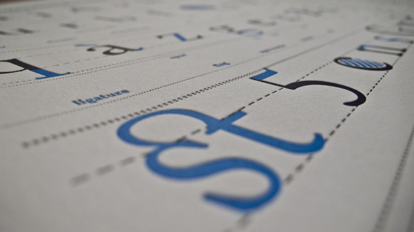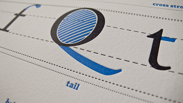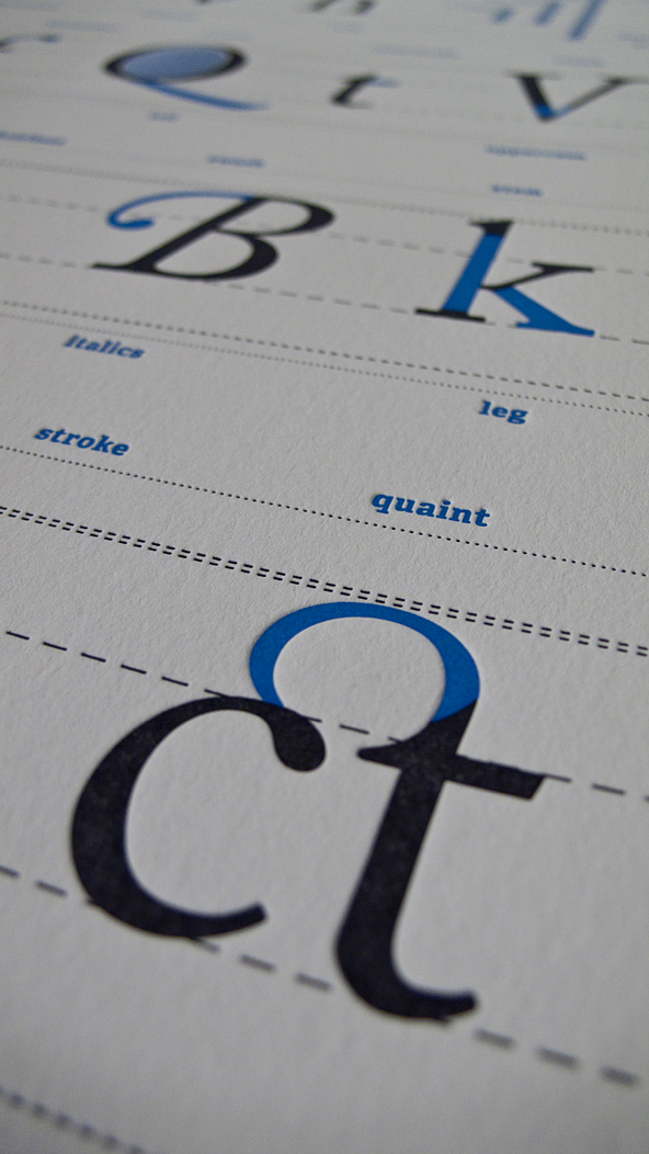
From Drew Binkley comes the Typography Deconstructed Letterpress Poster, printed by Studio on Fire on 16″ x 24″ Crane Lettra Pearl paper.
Talk with someone that’s worked with moveable type, and chances are you’ll hear something about the kiss. You may also hear that the modern practice of letterpress, using photopolymer plates, is void of the kiss. Most modern letterpress work has no kiss at all, but more of a debossing. A definite effect, typically on thick impressionable stock. Some don’t like the absence of the kiss but that doesn’t mean it can’t be done with modern equipment.
Drew’s poster was definitely done the modern way. But the deep impression looks good on the large type, perhaps set upwards of 72 point. I would have set the small type kissed, but you know… the price of production is always a consideration. Content-wise it shows the basics of letter form and terms with a few old esoteric names like quaint and lobe. Some of the definitions could use more detail but most do for explaining the concepts in simple terms.
Also, it’s set in Adobe Caslon. Not a bad choice at all.
Leave it to me to nitpick, I found a few details that could use a little work. Most people wouldn’t see them though. I’ll leave them to be discovered.
Typography Deconstructed, $100 *
* Drew was nice enough to offer Type Desk readers $10 off the poster with the use of a promo code: TypeDeskMarch2011 through the end of March.


Valerio/Francesco
Really smart poster but… come on, $100!
Jim
Beautiful piece of work. For those who can’t shell out the Benjamin, however, there is a rather nice type anatomy poster available as a free PDF download form Carson Park Design: http://tinyurl.com/typeanatomy
Gerald Lange
Letterpress, with that registration, yeah, price is probably fine. Why do the cheap skates even bother to post their opinions. Who cares? You’ve already indicated you have no class.
Joel Mielke
“…the deep impression looks good on the large type … I would have set the small type kissed…”
Standards have changed since the end of the age of letterpress. I recall how we took care not to leave an impression in paper when we printed on the old Heidelberg windmills. Now we so crave the tactile quality of letterpress, we’re disappointed with anything less than a deep impression.
Thanks for the link to my type anatomy pdf, Jim. If I were ever to produce it as a serigraph or a letterpress edition, I’m quite sure that the price tag would be at least $100. Also, I think that I’d ask Theo Rosendorf to review it before I print it.