


“Time for a typographic history of the science fiction franchise that spans half a century.”

Neubau Akademie™ TS 1–26 Limited Edition Specimen Box
A special limited edition box set celebrating the release of NB Akademie™ on October 31st, 2016 — now available for pre-order, shipping November 2016.

Alphabettes’ collection of their recent “My 2¢” series.

19th Century Theatre Converted to Bookstore
The El Ateneo Grand Splendid theatre in Buenos Aires has been converted to a bookstore.

Studio Creates 100 Unique Posters for Rotterdam Architecture Festival
100 unique posters by Studio Spass are on display throughout the streets of Rotterdam.
Granshan 2016 Call for Entries Deadline is August 31st
“From now on type designers, manufacturers or publishers have the chance to submit typefaces or type families in three new main categories.”

Such Threes and Sixes, Eights and Nines?
Gelett Burgess wrote his mayor a poem about the city’s bad street sign typography. Mayor La Guardia responded in kind.

Wanted: Freelance UI Designer
We need two UI designers for some riffing and responsive coding. We are a typographic design shop. We collaborate with clients on projects ranging from brand identity to UI designs for shop floor automation systems.
A work in progress – Nassim 2.0
“On May 17, 2006, I was in the process of defining Arabic mark positions for Nassim in a roundabout process involving a dummy FontLab MultipleMaster file, custom export scripts and Microsoft’s beloved Visual OpenType Layout Tool – VOLT.”

DAKU’s Typographic Sundial
“The first dedicated public art district in india came to life this year. as part of st+art, 25 local and international street artists descended upon the iconic lodhi colony area, turning the urban landscape into an open air gallery.”
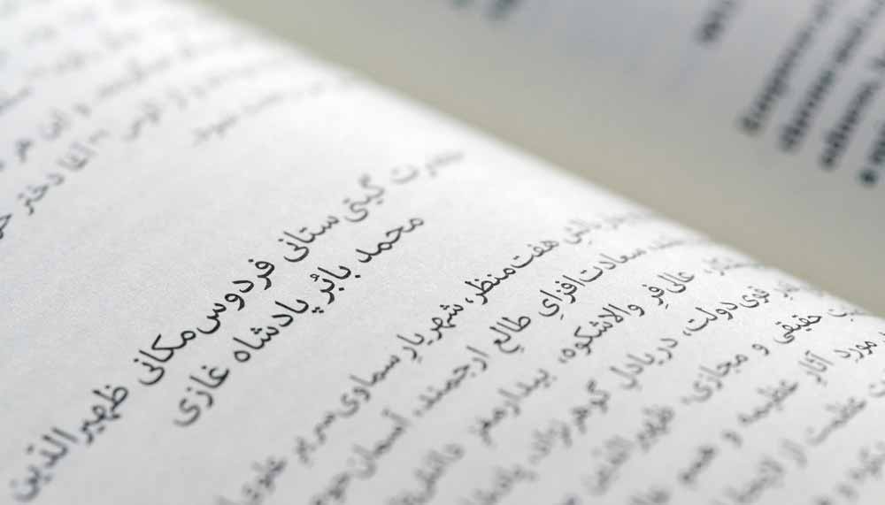
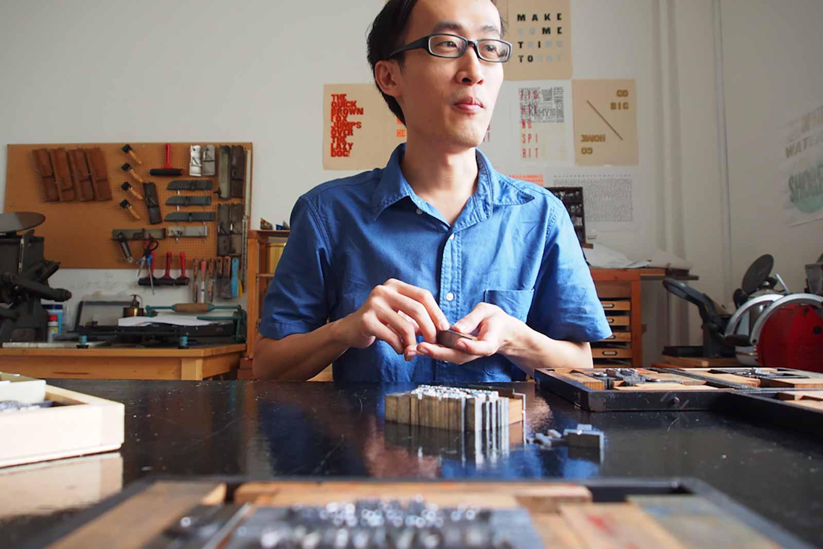
The Last Punchcutter
“If each company derives from an alchemy between people and techniques, the foundry of characters, whose heart is the engraving department, is an extraordinary example of skills and unequalled aesthetic sensitivity, which can be found in the documentary in the figure of Giuseppe Brachino, who was the head of the engraving department of the Nebiolo Company from Turin. He shows the creation of a punch, from which movable types derived, repeating the same gestures of Francesco Griffo who engraved the round and italic types of Aldus Manutius in Venice, five centuries ago.”
— Enrico Tallone
Via Typography.guru

Thanks @miklb
Mayor of London Makes Open Call to Creatives
“The Mayor of London Sadiq Khan is inviting creatives and agencies to submit strategic media ideas and visual responses to a new open-brief campaign declaring London open for business, innovation and culture.”
DesignStudio’s Transatlantic Bookshelf
“Founded in 2009, DesignStudio was set up by Paul Stafford and Ben Wright, and some of the agency’s biggest projects have included the Premier League rebrand earlier this year and the Airbnb revamp in 2014, both of which echo the studio’s ethos of helping brands to exist across different platforms.”
Is the Fight to Revive Traditional Letterpress a Losing Battle?
“Ask any letterpress lover why they favor the old-school printing method, and they’ll likely tell you it’s less about the look and more about the feel.”

Three Pioneers of Hebrew Graphic Design
The catalogue presents for the first time the works of three pioneers of the new Hebrew Letter: Moshe Spitzer, Henri Friedlaender and Franzisca Baruch.
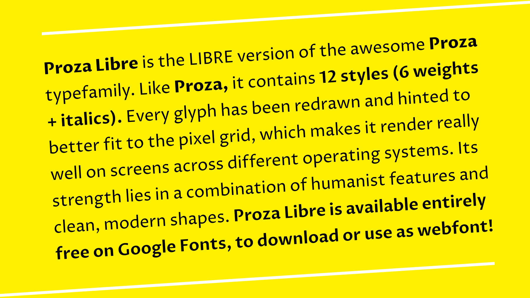
“When I started the development of Proza, I didn’t want to deal with the limitations of a low-resolution rasterizer. As a result, Proza is completely stuffed with diagonal and curved lines, and tiny details that help to bring the texture alive in print, but that are something of a nightmare for a low-resolution rasterizer.”
Tobias Frere-Jones Breaking Things Deliberately
“When trying to figure out a problem, pause for minute, and see if you can make it worse. A structure can really describe itself as it falls apart.” https://frerejones.com/
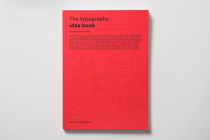
A new book by New York Times art director Steven Heller and graphic design expert Gail Anderson, The Typgraphy Idea Book: Inspiration from 50 Masters.
H&Co has released a collection of fonts specially designed for users of Microsoft® Word, Excel®, Powerpoint®, Pages®, Numbers®, and Keynote®.
![]()
Established in 1966, MasterCard is a technology company in the global payments industry.

TwoPoints’ Identity for a Spanish Design Award
Hamburg-based design studio TwoPoints has created this identity and catalogue for the ADI (Association of Industrial Design) in Barcelona.