It is amazing just how much text exists on the internet. More amazing still is the sheer amount of text that is unavailable. My typographic studies often have me turning to the stacks because the internet and e‑books are still oddly short on the subject.

I’ve met people that will not pick up a book for their unwavering allegiance to the screen. It’s hard to understand why someone would trade access to information for faster access to less information. The same sort of thing happened when computers replaced library card catalogs. The first systems were flawed. It was less likely that people would find books with titles that started with a letter that was halfway through the alphabet. Books toward the end of the alphabet went through a dark period. Are the print only books of today going through a dark period?
This post is in praise of the printed book. So in honor of information—and let’s face it, a superior reading experience—here’s to those books.
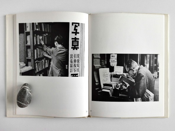
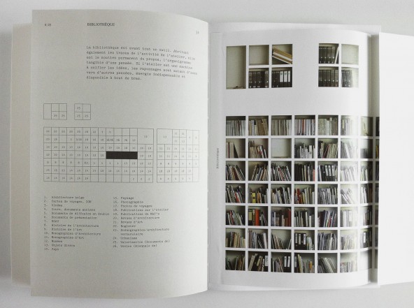
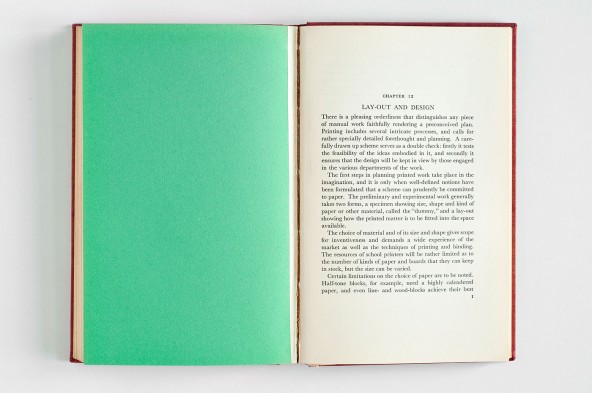
The following images are from a fantastic book collection titled “A Good Book” by Bernd Kuchenbeiser. Quite a few of his collected books are on type and design. Most are just lovably bookish.


From the about page:
“I love books. Yet I’ve never bought one just to own it. What fascinates me is their utility value: books can teach us things. It’s not only the writer that speaks to us. If we listen more closely, we can hear the voice of the designer or eavesdrop on the concert of materials. Books appeal not only to our eyes and ears: some we fall in love with the moment we take them in our hands. Many books also communicate non-verbally – they can flirt and seduce.”
Link: A Good Book
Edited by Bernd Kuchenbeiser (Twitter)