

More better webfonts: Adobe partners with Typekit
More better webfonts: Adobe partners with Typekit

Minimalist Album Covers, Lifeless?
What a way to suck the life out of things… But wait. These are are meant to be interpretations of existing work.


Jessica Hiche’s Letterpress Prints
Jessica Hiche’s Letterpress Alphabet Prints and other nice stuff…

An interview with Theo Rosendorf at Herman Miller’s Lifework Blog
“Is there any piece of home office furniture you most enjoy? My Eames Soft Pad Group Executive chair. I’ve had it for ten years and it just gets better with age. It doesn’t wear out, it wears in.”


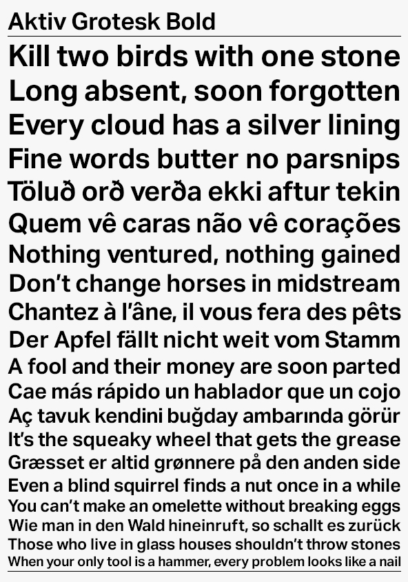
FF DIN Round
FontShop just released FF DIN Round, a nice contrast to Albert-Jan Pool’s initial remake of the old German standard typeface DIN 1451.


Fraktur Mon Amour, 2nd Edition
I have a thing for blacklettter and this looks good: Fraktur Mon Amour, 2nd Edition, by Judith Schalansky


New York: Inaugural Exhibition at the Newly Re-located Herb Lubalin Study Center of Design and Typography
On view at Cooper Union’s new gallery, an installation that includes recent posters, publications, and motion graphics by internationally recognized graphic designers that spotlight an emerging trend toward expressive lettering and typography.
Dan Reynolds’ Malabar Typeface Wins German Design Prize Gold
Alongside the likes of Audi, bulthaup, and BMW, Dan Reynolds’ Malabar typeface wins gold for the 2010 German Design Prize.
WANTED: Graphic Designers + a Ruby or Python Programmer
I’m searching for talent to fill five positions: (1) a full time graphic designer (web & print), (2) a contract or freelance graphic designer (web & print), (3) a contract or freelance package designer, (4) a free agent graphic designer (web & mobile), and (5) a free agent Ruby...
Read MoreDesign Projections Presents Justine Nagan’s Typeface Documentary in Montréal
Design Projections will host the Canadian premiere of Justine Nagan’s Typeface documentary in Montréal October 6th 2009.
Typography is Fashion on the Street at Selectism
If you’re in the neighborhood, check out my new column at Selectism.
Monocle Magazine Picks The Typographic Desk Reference as a Vital Life Improvement
The Typographic Desk Reference is one of Monocle Magazine’s Autumn picks of vital life improvements.
Rob Janoff on the Design of the Apple Logo
Ivan Raszl interviews Rob Janoff, the original designer of the Apple logo…
Utrecht City Theatre Identity Presentation
I picked up this video from FontFeed where they ran a story on Edenspiekermann winning two red dot awards for their work with Hering Berlin and Utrecht City Theatre.
The Faces Behind Typeradio
Type Radio is a periodic podcast of interviews with typographic experts.
Herb Lubalin Archives at Cooper Union
See some of Herb Lubalin’s work at Justin Thomas Kay’s photo collection of the Herb Lubalin archives at Cooper Union.
The TDRme Ugly Type Winner is…
Artem Antoniuk! As you can see, Artem’s picture is so bad, his dog went blind…
Times New… Mompen?
The history books will tell you that Times New Roman was designed by Stanley Morison. Mike Parker aims to rewrite that history…
I’m Combining Subscription Lists for my Book (The Typographic Desk Reference) and Type Desk
Due to the growing complexity of managing multiple subscription lists, I’ve decided to combine the lists for my book (The Typographic Desk Reference) and Type Desk…
Network Solutions Gets a Rebrand
Here’s a preview of what Network Solutions is up to with a thorough rebrand and improvements to infrastructure.

Ellen Lupton Blogs for Fast Company
Ellen Lupton now writes an inspiring column at Fast Company on the design of business, and life.
TDRme Deadline Extended to 7/31 [Ugly Typography]
The TDRme contest to win a signed copy of The Typographic Desk Reference has been extended to Friday July 31st.

Behind Scrabble’s “The Beautiful Word”
jawbone.tv has published a great article detailing what went into the making of Scrabble’s “The Beautiful Word” campaign.
TDRme Submission Rules [Ugly Typography]
To win a signed copy of the Typographic Desk Reference, submit a graphic of your finest creation of terrible typography. The most appalling example wins.

TDR Giveaway
Win a signed copy of the Typographic Desk Reference by following me on Twitter and Tweeting #TDRme
Webponce’s Visual Dictionary
Launched in February 2006, The Visual Dictionary is a massive collection of searchable user submitted typographic photographs with over 7,500 images of over 4,000 words.
The Work of Fiodor Sumkin
Russian born illustrator Fiodor Sumkin makes great satirical drawings incorporating some nice hand lettering.

US Ration Coupons 1942–1945
Duke University’s Ration Coupons on the Home Front shows how the US government controlled and conserved vehicles, typewriters, sugar, shoes, fuel, and food from 1942–1945.
Typekit Gets A Round
San Francisco, Calif. — June 24, 2009 — Small Batch Inc. announced today that they have secured a round of equity funding from a group of investors led by San Francisco-based True Ventures. Small Batch is developing Typekit, a service enabling designers to build sites with web-native typography.
Office in the Woods by Selgascano
Spanish architects Jose Selgas and Lucia Cano of Selgascano have designed my dream office in the woods near Madrid in Spain…
The ever popular “Jockstrap-font”
From calligrapher Pier Gustafson comes a display font formed from a jockstrap…
TDR Makes abduzeedo Site of the Week
abduzeedo: Abducted by Design chose the Typographic Desk Reference website as one of their sites of the week.
Wanted: Web Design Interns
I’m searching for graphic designers looking to bolster their experience and amp their CV…
Paul Mijksenaar’s Wayfinding Design
Short video interview with Paul Mijksenaar on wayfinding design…
Paul Mijksenaar’s Wayfinding Design
Short video interview with Paul Mijksenaar on wayfinding design…
Obama’s Art with Dumb-Quote
The Obama’s are redecorating the White House walls. Ed Ruscha’s “I Think I’ll…” (1983) (shown above) was one of the pieces selected for placement. It was borrowed from the National Gallery. Typographers and graphic designers can spot this work’s shortcoming with a deep rooted embarrassment. There’s an error with...
Read MorePractical Instructions of The Iliad
While your classic literature reads like stereo instructions, keep in mind e‑books won’t always be like this…
Tare Lugnt’s Latest Issue – Tattooed
The latest issue of Marc Strömberg’s magazine Tare Lugnt has been tattooed on his leg. Large-scale prints will go on display in Göteborg and Stockholm this month. More info at the Wall Street Journal and the Tare Lugnt site.
Tare Lugnt’s Latest Issue – Tattooed
The latest issue of Marc Strömberg’s magazine Tare Lugnt has been tattooed on his leg. Large-scale prints will go on display in Göteborg and Stockholm this month. More info at the Wall Street Journal and the Tare Lugnt site.
TDR at The TDC in NYC
I’ll be signing copies of The Typographic Desk Reference at the inaugural Type Directors Club Book Fair May 29th – 30th…
Type Geek Space Craft
I’ll be speaking about setting type and some finer points of proportion and space next Thursday April 29th at the Atlanta Web Design Group meeting…
Typographic Keyboard Layout
Typing ×, or any other special character, takes a fraction of the time it used to with Ilya Birman’s Typography Keyboard Layout. Beware it will adjust some keyboard shortcuts, but switching back to your old layout will fix it. Link via multiple sources
How to Host an Event
The Typographic Desk Reference release party was a success. Thanks to everyone who was able to make it and to those who sent emails, texts, tweets, and voicemails in lieu…
Helvetica Moleskine
If only Swiss bank accounts were what they used to be, I’d go old school and keep record in one of these Helvetica Moleskines. Link via i love typography → nubbytwiglet.com
TDR Book Release Party
Join us to celebrate the release of The Typographic Desk Reference, Friday March 20th, 5:30 – 9:00 pm at Atlanta’s (context)…
Died Young, Stayed Pretty
A documentary on the North American underground poster culture, Died Young, Stayed Pretty is Produced, Directed, shot, and Edited by Eileen Yaghoobian. Looks good.
Sol Sender on Obama Logo Design
Creative director Sol Sender talks about the design and development of the Obama 08 logo.
e‑books vs paper, what’s your take?
Are you an old school bibliophile? Do you care what font a text is set in? Is resolution an issue? Is print dead?
e‑books vs paper, what’s your take?
Are you an old school bibliophile? Do you care what font a text is set in? Is resolution an issue? Is print dead?
TDR Site Makes 2009 Web Trends List
The Typographic Desk Reference website makes Smashing Magazine’s list of Web Design Trends For 2009…
Typenuts
John from I Love Typography has put together Typenuts: a site where you can download and submit typographic desktop and iPhone wallpapers.
Calling All Gridniks
Antonio Carusone (AisleOne) along with Duane King (Thinking for a Living) offer an excellent resource on the typographic grid. Rid your postmodern habits at The Grid System.
Gepostet von Stani’s €5 Font
The Dutch Ministry of Finance organized an architecture competition for which a selected group of architectural offices and artists were invited to design a 5 euro coin around the concept of “Netherlands and Architecture.” Gepostet von Stani’s winning design renders the traditional portrait of the queen with a list of...
Read MoreGepostet von Stani’s €5 Font
The Dutch Ministry of Finance organized an architecture competition for which a selected group of architectural offices and artists were invited to design a 5 euro coin around the concept of “Netherlands and Architecture.” Gepostet von Stani’s winning design renders the traditional portrait of the queen with a list of...
Read MorePreview: The Typographic Desk Reference
The Typographic Desk Reference (TDR) is now available for pre-order through Oak Knoll…
MetaSerif
We’re anxiously awaiting the release of Meta Serif, the companion face to Erik Spiekermann’s epic Meta.
Wim Crouwel Interview
https://youtube.com/watch?v=I5y3px4ovxE Designer Wim Crouwel at Galerie Anatome, Paris, February 2007.
Lucky Numer 13
Superstitious passengers force Brussels Airlines to add a 14th dot to their logo.
Helvetica Film Videos & Prints
New video clips and letterpress prints have been posted to the Helvetica film website.
Fred Eerdekens’ Light Play
Fred Eerdekens is showing Nr. 14 Light Play, Z33, Hasselt (B), Belgium October 29, 2006–January 21, 2007
Helvetica, The Movie
Helvetica is a feature-length independent film about typography, graphic design and global visual culture. The film was shot in high-definition on location in the United States, England, the Netherlands, Germany, Switzerland, France and Belgium. It is currently in post-production and is slated to begin screening at film festivals worldwide...
Read MoreThe Thermochromic Egg
The UK’s Lion Quality is to start producing eggs with temperature-sensitive thermochromic print to let you know when it’s cooked soft, medium or hard-boiled.
Adrian Frutiger: The Man of Black & White
German translator Christine Kopp writes and directs Adrian Frutiger, The Man of Black and White: a documentary about the type designer Adrian Frutiger.
Adrian Frutiger: The Man of Black & White
German translator Christine Kopp writes and directs Adrian Frutiger, The Man of Black and White: a documentary about the type designer Adrian Frutiger.
Kathryn Cho’s Typecast
From Kathryn Cho comes Typecast: A Documentary on Swiss Design. Can’t wait to see it!
De Morgen Redesigns, from Tabloid to Berliner
Belgian’s broadsheet De Morgen—won Europe’s best designed newspaper in 2004—gets a redesign to a larger format with full color and new typography. The new typefaces are Gotham for section headers and the flag, Capitolium for headlines and body text, and ITC Conduit for summary decks, photo credits, graphics, etc. Link:...
Read MoreCall for Entries: Iranian Proverbs
5th Color organizes Iranian Sayings, The Third Iranian Typography Exhibition 2006. It will be held at the Tehran Gallery, Faculty of Fine Arts, University of Tehran on June 8–21, 2006. Call for entries link
RIP Richard Eckersley
“Good design is the process of solving the problem posed by the manuscript.” —Richard Eckersley Richard Eckersley, an award-winning graphic designer who introduced unconventional typography to staid-looking university-press books, died on Sunday at his home in Lincoln, Neb. He was 65. — New York Times
Monotype Clones Frutiger For Microsoft
Microsoft will be using a font named Segoe UI, for their new Vista operating system. Agfa Monotype created Segoe UI for Microsoft. Agfa Monotype claims to have designed it, but it’s actually a copy with minor modifications of Linotype’s Frutiger Next font. In January 2004 Microsoft applied to register multiple...
Read MoreLigatures
A ligature is a character consisting of one or more connecting letters. As in the graphic above, sauerstoffflaschen—the German word for oxygen tank—is the only word to contain the “fffl” ligature. It also contains the decorative “st” ligature. Below are examples of standard and decorative ligatures. Letter pairs with their...
Read MoreUse of the ampersand & and
When is it appropriate to use an ampersand “&” instead of the word “and”?
Type Radio
From Underware comes Type Radio. Type Radio has MP3 radio streams and Podcast downloads on topics of typography and design from Matthew Carter et al. (Link via Laurie Forehand)
The Double-Space Debate
So, what’s your opinion? A, B, or C? [A] Two spaces after a period is the proper way to set type. [B] With the white space above the point, one space after a period is all that’s needed. [C] The physical space after a period should be thinner to...
Read MoreDaily Type
Very nice. So, how long can they keep it up? “Daily Type is a creative project run by four russian type designers. Day by day, they create original typefaces and post their results along with routine.”
One Plus Beirut by Stephen Banham
At 1+1=3, Stephen Banham creates a photo album of his trip to Typo.Graphic.Beirut 2005.
Typophile Beta
The new Typophile website contains a “typowiki”. The Typophile Wiki is a “user-created encyclopedia of all things type-related. Users create and edit Wiki entries with the aim of becoming a collaborative, useful and relevant resource.”
Typo.Graphic.Beirut 2005
Typo.Graphic.Beirut 2005 is the first of its kind within the Middle East’s graphic design community, and will feature more than 20 speakers contributing to an atmosphere of design thought and practice from regions all over the world.

Read Regular
Designed to assist dyslexic readers, Read Regular is a typeface designed by Dutch designer Natascha Frensch. Letterforms like b and d are typically drawn as the same character and then just swapped. Read Regular differentiates these forms by making each unique.
Save the French Imprimerie Nationale heritage
Graphê, association pour la promotion de l’art typographique is petitioning to preserve the heritage of the French government printing organization.