

Posters for Migrants
For the holidays and into 2019, we are donating half of our poster sales to support Central American migrants seeking asylum in the United States — AKA the “Migrant Caravan.”
logoarchive on Instagram
A study of form language in logo design. Updated frequently. A project by BP&O. — bpando.org
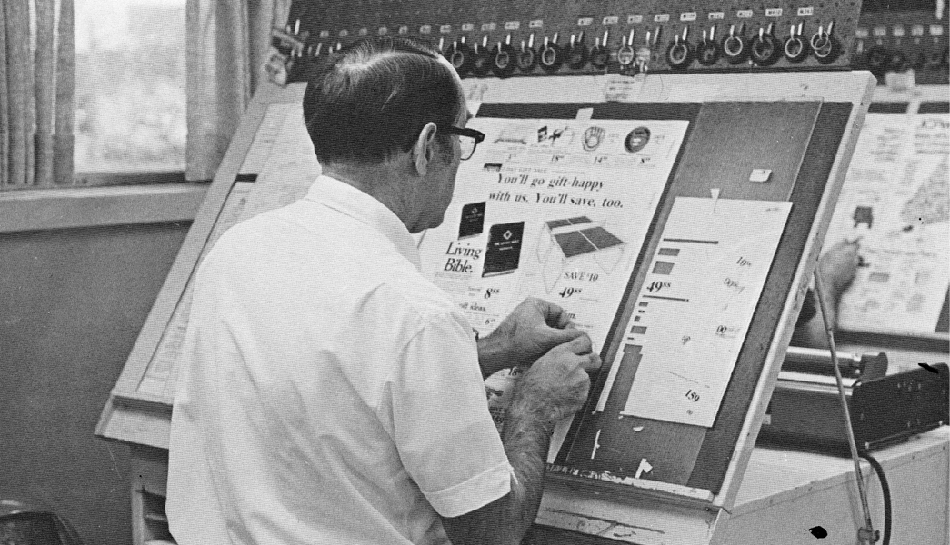
Graphic Means — A History of Graphic Design Production
It’s been roughly 30 years since the desktop computer revolutionized the way the graphic design industry works.
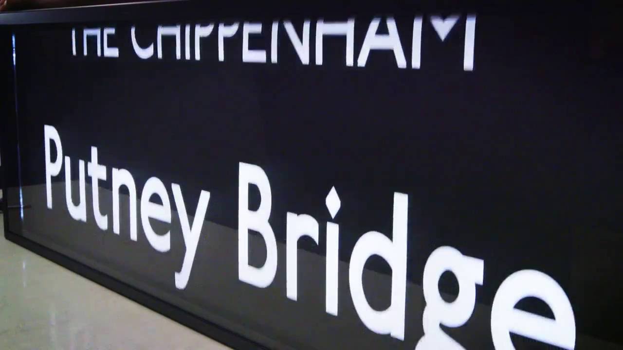
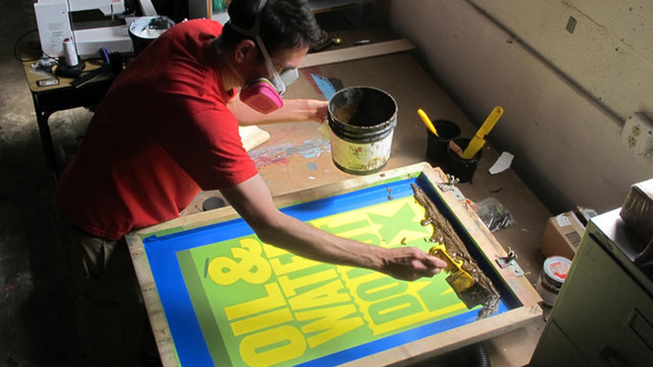
The Making of Bus Blinds
The level of care that is taken with these handmade objects is impressive.

28 Days of Type News
The Fonts of Star Trek “Time for a typographic history of the science fiction franchise that spans half a century.” Neubau Akademie™ TS 1–26 Limited Edition Specimen Box A special limited edition box set celebrating the release of NB Akademie™ on October 31st, 2016 — now available for pre-order, shipping November 2016. My...
Read More
Grafica Della Strada, The Signs Of Italy
It starts with a 16 year old Louise Fili traveling to Italy, stepping off the plane, and falling in love with a billboard. That moment marked the start of Fili’s typographic obsession, and budding career in graphic design. (more…)
Fonts of the Homeless
Typefaces based on the handwriting of homeless people in Barcelona. All proceeds go to the Arrels Foundation, an organization for the benefit of Barcelona’s homeless.
Sign Painters: The Movie
Sign Painters celebrates the hand-painted sign industry, an American tradition. (more…)
The Making of Neon Signs
‘Every neon sign has a “start and stop position,” a point on each letter where a tube begins and ends. (more…)


The typographic work of Alex Fowkes for Sony Music
Alex Fowkes designed this great mural of Sony Music’s history, illustrated with mostly type.


The British Library’s 60,000-Book iPad App
Charleston, SC & London, UK — BiblioLabs, LLC and the British Library are proud to announce their British Library 19th Century Historical Collection App for iPad is now available on the App Store.
Wanted: 25 Graphic Designers
We need 25 contract/freelance designers for a short project with Agfa.

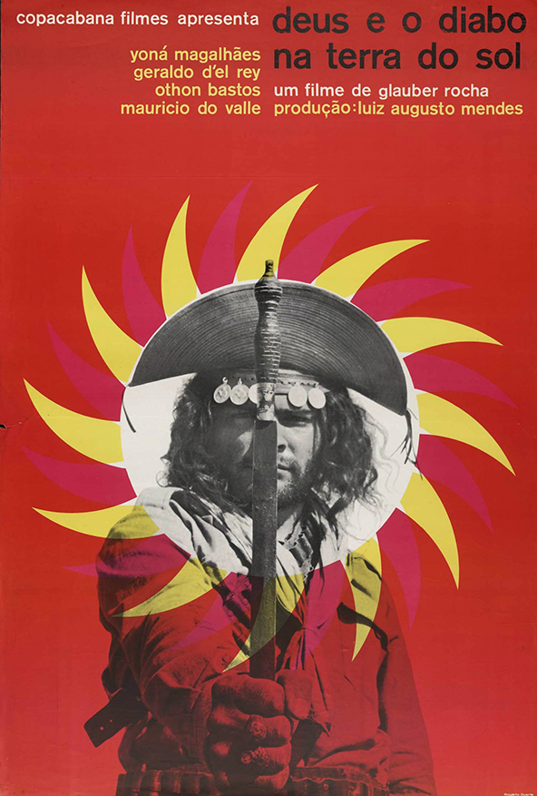
Brazilian Movie Posters
Poster for God and the Devil in the Land of the Sun, 1964 I truly love movies and movie posters. Currently Brazilian film is experiencing a kind of renaissance, but it was not always this way. In this post I’d like to share a series of posters for Brazilian cinema,...
Read MoreThe Blue Lady’s New Look
From JKR, the Camden based packaging design agency, comes an intriguing collection of marketing and branding quips titled “The Blue Lady’s New Look and Other Curiosities: Posts from the Crossroads of Design and Marketing.”

John Fuller’s Sycamore Press
Ryan Roberts, purveyor of the official websites for Julian Barnes, Ian McEwan, James Fenton, Hermione Lee, and Ian Hamilton, has authored “John Fuller and the Sycamore Press: a bibliographic history.”

Typography Deconstructed Letterpress Poster
From Drew Binkley comes the Typography Deconstructed Letterpress Poster, printed by Studio on Fire on 16″ x 24″ Crane Lettra Pearl paper.

My New Favorite Maps
These typographic maps are the real deal. Although typographic maps are not a new idea, few are created manually. Even fewer possess the degree of quality seen here.


All the Buildings in New York
James Gulliver Hancock attempts to draw all of the buildings in New York City.

A Poster for São Paulo
Celebrating the 457th anniversary of São Paulo, the designer Paulo Moretto, along with Alécio Rossi created the exhibit “A Poster for São Paulo”.


Monocle Alpino, Anti-iPad Device
Monocle’s Alpino newspaper may be called an experiment, but it’s a successful extension to the Monocle brand—a great variation on a theme.


Eastern European Matchbox Labels
Mid-century mass production printing on cardboard has a unique look that’s emulated quite a bit these days.

Jan Tschichold for Penguin Scores, 1949
Oliver Tomas has posted some nice mid-century visual inspiration with his Penguin Book Covers Flickr Collection.

A Magazine Designer’s Guide to Designing Magazines
Every shipment of Stack America comes with an exclusive magazine-themed print.

On Maps Made of Words and Automated Design
Aegir Hallmunder on typographic maps and wether automated design is good or bad.

ZEITtype for Die Zeit by Oleksandr Parkhomovskyy
Oleksandr Parkhomovskyy created this stout white-line blackletter of all caps for Germany’s weekly paper Die Zeit.

Bracket
“Bracket is a conceived as a publication that features everything in between — ideas, voices and processes that are overlooked and under-appreciated.”

1140px Grid System
A 1140px-wide, 12 column grid system that breaks down elegantly with smaller browser sizes.

Clipper Ship Cards
These vintage clipper cards were advertisements for shipping voyages, usually from a port on the east coast (New York, Boston) to the west coast (San Francisco). They were distributed by ship dispatchers in the 1800s.

MyFonts’ Creative Characters by Jan Middendorp
Landing on my desk is this great compilation of type designer interviews done by Jan Middendorp for MyFonts entitled Creative Characters.

Reverting to Type
“It is New North Press’ great pleasure to invite you to our very own typographic extravaganza! Curated by Graham Bignell & Richard Ardagh, Reverting to Type will showcase the work of twenty contemporary letterpress practitioners from around the world, contributions from three leading art colleges and the first eight...
Read More
Beware of the Dogma
“Beware of the Dogma is a booklet for graphic designers wishing to reflect on and question notions of design as a discipline. It explores the theoretical nature of rules and obedience to them using extracts from an interview with a legal philosopher and the theories of Hart and Kemp....
Read More
A Battle of Wills
“A response to the 2010 International Society of Typographic Designers’ ‘Imbalance’ brief. A Battle of Wills explores tensions between the government and British citizens. The book was awarded a merit and also is shortlisted for the British Book Design & Production Awards 2010.”

8 Faces by Elliot Jay Stocks
“Printed on heavy stock, with a foil-blocked cover, and pressed at just 2500 limited editions, each issue is a true collector’s item. 8 Faces will be more at home on your bookshelf than in your magazine rack. Who said print is dead?”

Labels from the 19th and 20th Centuries
Packaging and labels from the 18 and 1900s, for everything from mucilage to vinagre balsamique.
Erik Spiekermann on Deutsche Welle TV
On the heels of having won the Federal German Design Prize 2011 Lifetime Achievement Award from the German Design Council, Erik Spiekermann is interviewed by Deutsche Welle TV.

50 Reading Lists for Designers
“Spin/2 – 50 Reading Lists, a paper based on asking major figures in graphic design the question: what are the top ten books that you believe designers should read?”
Type Desk Welcomes Yoko Sakao Ohama
Yoko joins Type Desk to report from New York on design and logical process. Logical as apposed to illogical. Having worked with Yoko, I guarantee it’s a privilege to experience Yoko’s “logical process.” Welcome aboard Yoko!

René Gruau’s Work for Dior
“Since founding her Munich-based graphic arts gallery, Bartsch & Chariau, in 1980, Joëlle Chariau has been an advocate of René Gruau, writes Liz Farrelly. Across the river from the Design Museum’s Drawing Fashion exhibition (where Chariau discussed fashion illustration), the Embankment Galleries at Somerset House are staging Dior Illustrated:...
Read More
Making Grids with Sigurður Ármannsson’s Easy Grid Calculator
Sigurður Ármannsson explains how to use his Easy Grid Calculator to produce square document grid units based on leading.


Crumpled City Map by Emanuele Pizzolorusso
“It just takes 2 seconds to open and close this innovative soft map.”
The WSJ Hedcuts by Randy Glass
Everyone has seen his work. Master stippler Randy Glass has created hundreds of these hedcut style illustrations for the Wall Street Journal.
Hand Drawn Type
Most people are surprised to find how much type isn’t set with fonts on the computer but hand drawn. This is usually the case with most old signs and billboards, made when type didn’t exist or just wasn’t easily accessible. Typography Served has posted a few nice examples of...
Read More
The 365 Calendrical Notebook
“365 is a calendrical notebook with serially numbered pages and an A to Z. The latest editions are again thread-stitched and either available with 12 rainbow-coloured papers or with Alster Werkdruck and gold-edging on three sides. Typeset in Poster Bodoni, designed by Greige/Buero fuer Design, printed and bound in...
Read More
Bags from the Past: the Airline Bag Lounge
This is a little old, but it’s still good: the Airline Bag Lounge brought to you by Troyland.

Hans Rosling’s 200 Countries over 200 Years in 4 Minutes
Hans Rosling on BBC Four’s “The Joy of Stats”
Ordering Disorder, Grid Principles for Web Design
This is definitely on my list. Ordering Disorder: Grid Principles for Web Design (Voices That Matter) by Khoi Vinh

CNN en Español Gets a Tilde
Having done work at CNN and other Turner properties, this excellent new ID for CNN en Español jumped out for us. It’s close to home for those in Atlanta.

Jonathan Safran Foer’s Unmakeable Book
“Book printers said the award winning author’s design “could not be made.” Belgian publishing house Die Keure proved them wrong.”


Flowers + Newsprint, Beautiful
“Fresh Flowers is a collection of flowers, it’s a different newspaper, it’s a way of having flowers on your table everyday.”

Supergraphics from Unit Editions
Supergraphics just arrive at my desk. Unit Editions has a knack for superlative documentation of creative objects…
The Story Behind Angry Paul Rand
“Over three months in the Summer of 2010, in addition to my normal Twitter account @mgoldst, I had a Twitter account by the name of @AngryPaulRand. Like every designer I have ever met, I had some things I had always wanted to say, and using Paul Rand as a...
Read More
Copenhagen Wall Calendar by Urbncal
“urbnCal 2011 Copenhagen has a graphic look with black and white photographs and red colour (pms 206) in twelve different shades. The calendar is photographed in different areas of Copenhagen, one area per month, starting from the center and out in a clockwise motion.”

Gary Anderson, Designer of ♻
“It has been called one of America’s “most important design icons,” it is one of the most recognizable graphic symbols in the world and has helped to encourage global recycling. In some countries, such as the UK, the symbol carries such implicit meaning that it requires government permission to...
Read More

Prison Tattoos of Danzig Baldaev
Rick Poynor on the Russian prison tattoo flash art of Danzig Baldaev on show in London along with photographs of tattooed prisoners by Sergei Vasiliev.

The Ames Lettering Contraption
“Oh, bedeviling Ames Guide! How curious your strange shape, your myriad holes filled with murk and mystery. What–what??–are you for??”
Graphic Design and Your Soul
Dan Reynolds’ review of the second edition of Adrian Shaughnessy‘s How to be a graphic designer without losing your soul.

A 2011 Calendar with Rhythm by NEWWORK
“By composing dates as music notes, simply hoping the calendar could give viewers a smile in 2011. The calendar is silk screened on large ( 26″ x 40″) and thick weight stone henge paper which is very gorgeous.” Available for $48 from NEWWORK. Via Selectism

Paris vs New York, A Graphic Tally
“A visual but friendly match between those two cities seen by a lover of Paris wandering through New York’s infinite details, clichés and contradictions”

Nice Job, Robb—The “the” Project
“Wordmarks from a private stock of predigital lettering scoured from low resolution archives, personally converted to bezier outlines by Robb for use by today’s graphic designers who appreciate the wonky shapes of yesteryear.”

Colophon’s Aperçu
Brighton based designers Anthony Sheret and Edd Harrington have recently launched their specimen catalogue to accompany the release of Aperçu, the latest font to come out of their font foundry, Colophon.


Are you a … Type Snob!?
Type Snob, call for entries. To earn this distinguished title submit your work in this year’s Type Directors Club competitions.


Selfridges Tea Packaging by Noreen Khan & Lewis Moberly
Selfridges Tea Packaging by Noreen Khan & Lewis Moberly (at Lovely Package)

Sheffield Honey Company Identity by DED Associates
The Sheffield Honey Company Brand by DED Associates (via Brand New)


Project C‑90 Audio Cassette Image Archive
“… This page is dedicated to cassette tapes… Here you won’t find any kind of scientific research, technical data or things like that…”
W’s new W
In response to declining circulation figures, Condé Nast hired Stefano Tonchi. Tonchi’s first task was to relaunch the magazine, and the logical starting point was the masthead.


Plantin-Moretus Awards for Best Designed Books 2010
Font Shop’s coverage of the Plantin-Moretus Awards for Best Designed Books 2010
Prism Packaging by BOB Helsinki
Helsinki based BOB Helsinki designed the look and concept for Prism.

Nijhof & Lee: Amsterdam’s Best Bookstore
No graphic designer or typophile should miss a trip to Nijhof & Lee.


Minimalist Album Covers, Lifeless?
What a way to suck the life out of things… But wait. These are are meant to be interpretations of existing work.


An interview with Theo Rosendorf at Herman Miller’s Lifework Blog
“Is there any piece of home office furniture you most enjoy? My Eames Soft Pad Group Executive chair. I’ve had it for ten years and it just gets better with age. It doesn’t wear out, it wears in.”

Werner Herzog’s Rogue Film School
“Werner Herzog’s Rogue School. This is how graphic design should be taught” http://bit.ly/9VTzIt (via @AJWShaughnessy)


Fraktur Mon Amour, 2nd Edition
I have a thing for blacklettter and this looks good: Fraktur Mon Amour, 2nd Edition, by Judith Schalansky


New York: Inaugural Exhibition at the Newly Re-located Herb Lubalin Study Center of Design and Typography
On view at Cooper Union’s new gallery, an installation that includes recent posters, publications, and motion graphics by internationally recognized graphic designers that spotlight an emerging trend toward expressive lettering and typography.
WANTED: Graphic Designers + a Ruby or Python Programmer
I’m searching for talent to fill five positions: (1) a full time graphic designer (web & print), (2) a contract or freelance graphic designer (web & print), (3) a contract or freelance package designer, (4) a free agent graphic designer (web & mobile), and (5) a free agent Ruby...
Read MoreDesign Projections Presents Justine Nagan’s Typeface Documentary in Montréal
Design Projections will host the Canadian premiere of Justine Nagan’s Typeface documentary in Montréal October 6th 2009.

Unit Editions Makes Books for Designers
From Adrian Shaughnessy and Tony Brook comes Unit Editions, a south London publishing company producing books on design and visual culture. I talked with Adrian Shaughnessy to get up to speed with what’s in store at Unit Editions.
Here’s your “immersive experience” – Vitsœ Turns 50
I still cringe when I hear the term “immersive experience.” But Vitsoe’s site makes masterful use of the medium, and dare I say, delivers an immersive experience in the process.
Rob Janoff on the Design of the Apple Logo
Ivan Raszl interviews Rob Janoff, the original designer of the Apple logo…
Utrecht City Theatre Identity Presentation
I picked up this video from FontFeed where they ran a story on Edenspiekermann winning two red dot awards for their work with Hering Berlin and Utrecht City Theatre.
The Faces Behind Typeradio
Type Radio is a periodic podcast of interviews with typographic experts.