

28 Days of Type News
The Fonts of Star Trek “Time for a typographic history of the science fiction franchise that spans half a century.” Neubau Akademie™ TS 1–26 Limited Edition Specimen Box A special limited edition box set celebrating the release of NB Akademie™ on October 31st, 2016 — now available for pre-order, shipping November 2016. My...
Read More
Grafica Della Strada, The Signs Of Italy
It starts with a 16 year old Louise Fili traveling to Italy, stepping off the plane, and falling in love with a billboard. That moment marked the start of Fili’s typographic obsession, and budding career in graphic design. (more…)

Type Rules! 4th Edition
The latest edition of Type Rules! is on the shelves and it was worth the wait. (more…)

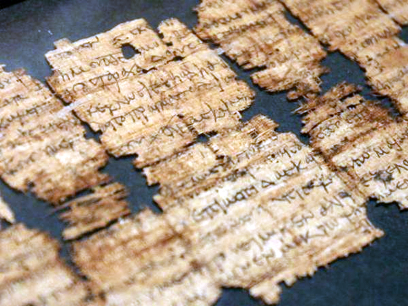
The Old Printing Office
The Old Printing Office by Frank Luther Mott is an account of Mott as a printer’s devil for his father’s small town weekly papers in Iowa.

Book Life
It is amazing just how much text exists on the internet. More amazing still is the sheer amount of text that is unavailable.

The British Library’s 60,000-Book iPad App
Charleston, SC & London, UK — BiblioLabs, LLC and the British Library are proud to announce their British Library 19th Century Historical Collection App for iPad is now available on the App Store.

The Curious Misconception Surrounding Sentence Spacing
There’s a widespread misconception that “proper” English requires two word spaces after a sentence.
The Blue Lady’s New Look
From JKR, the Camden based packaging design agency, comes an intriguing collection of marketing and branding quips titled “The Blue Lady’s New Look and Other Curiosities: Posts from the Crossroads of Design and Marketing.”

John Fuller’s Sycamore Press
Ryan Roberts, purveyor of the official websites for Julian Barnes, Ian McEwan, James Fenton, Hermione Lee, and Ian Hamilton, has authored “John Fuller and the Sycamore Press: a bibliographic history.”


Chicago Manual of Style, 16th Edition
In 1906, a small university press in Chicago published its standardized typographical practices.

John Rodker’s Ovid Press
Gerald W. Cloud, author of John Rodker’s Ovid Press: A Bibliographical History, is an investigator with a bent for narrative writing about books.

The Moleskine Debossing Process
A charming video showing the process behind custom debossed Moleskines.

Bodoni’s Manuale Tipografico (1818) is Online
A copy of Giambattista Bodoni’s Manuale Tipografico has been photographed and posted by the Rare Book Room.

Detail in Typography by Jost Hochuli
Hands down, Hyphen Press has the best typeset and thoughtfully bound books on type.

Jan Tschichold for Penguin Scores, 1949
Oliver Tomas has posted some nice mid-century visual inspiration with his Penguin Book Covers Flickr Collection.

5 Year Datebook
“Black covered cover. Removable transparent plastic protective case. A two-page spread for each week. Daily schedule from 8am to 10pm.”

MyFonts’ Creative Characters by Jan Middendorp
Landing on my desk is this great compilation of type designer interviews done by Jan Middendorp for MyFonts entitled Creative Characters.

Beware of the Dogma
“Beware of the Dogma is a booklet for graphic designers wishing to reflect on and question notions of design as a discipline. It explores the theoretical nature of rules and obedience to them using extracts from an interview with a legal philosopher and the theories of Hart and Kemp....
Read More
A Battle of Wills
“A response to the 2010 International Society of Typographic Designers’ ‘Imbalance’ brief. A Battle of Wills explores tensions between the government and British citizens. The book was awarded a merit and also is shortlisted for the British Book Design & Production Awards 2010.”

8 Faces by Elliot Jay Stocks
“Printed on heavy stock, with a foil-blocked cover, and pressed at just 2500 limited editions, each issue is a true collector’s item. 8 Faces will be more at home on your bookshelf than in your magazine rack. Who said print is dead?”

50 Reading Lists for Designers
“Spin/2 – 50 Reading Lists, a paper based on asking major figures in graphic design the question: what are the top ten books that you believe designers should read?”

Hart’s Rules for Compositors and Readers
From 1967 and a great resource for info on setting type. An updated version is also available: Hart’s Rules for Compositors and Readers.

The 365 Calendrical Notebook
“365 is a calendrical notebook with serially numbered pages and an A to Z. The latest editions are again thread-stitched and either available with 12 rainbow-coloured papers or with Alster Werkdruck and gold-edging on three sides. Typeset in Poster Bodoni, designed by Greige/Buero fuer Design, printed and bound in...
Read MoreOrdering Disorder, Grid Principles for Web Design
This is definitely on my list. Ordering Disorder: Grid Principles for Web Design (Voices That Matter) by Khoi Vinh

Jonathan Safran Foer’s Unmakeable Book
“Book printers said the award winning author’s design “could not be made.” Belgian publishing house Die Keure proved them wrong.”

Prison Tattoos of Danzig Baldaev
Rick Poynor on the Russian prison tattoo flash art of Danzig Baldaev on show in London along with photographs of tattooed prisoners by Sergei Vasiliev.
Graphic Design and Your Soul
Dan Reynolds’ review of the second edition of Adrian Shaughnessy‘s How to be a graphic designer without losing your soul.
Alain de Botton at Herman Miller’s Lifework
Alain de Botton interviewed at Herman Miller’s Lifework Blog

1862 Cyrillic Type Specimen at Google Books
Maxim Zhukov has unearthed an 1862 Cyrillic type specimen at Google Books.

Plantin-Moretus Awards for Best Designed Books 2010
Font Shop’s coverage of the Plantin-Moretus Awards for Best Designed Books 2010
Bildschöne Bücher
Bodo von Hodenberg of Berlin’s Bildschöne Bücher offers a novel angle to book dealing. Born out of his successful 25books.com, Hodenberg takes a curatorial approach to selling books on photography, art and design. See a video on Bildschöne Bücher at Monocle.