

The Last Punchcutter
“If each company derives from an alchemy between people and techniques, the foundry of characters, whose heart is the engraving department, is an extraordinary example of skills and unequalled aesthetic sensitivity…”
Fonts of the Homeless
Typefaces based on the handwriting of homeless people in Barcelona. All proceeds go to the Arrels Foundation, an organization for the benefit of Barcelona’s homeless.

Type Rules! 4th Edition
The latest edition of Type Rules! is on the shelves and it was worth the wait. (more…)


The typographic work of Alex Fowkes for Sony Music
Alex Fowkes designed this great mural of Sony Music’s history, illustrated with mostly type.
Inside the office of Hoefler & Frere-Jones
A highlight of 2013, this video was part to a presentation of the AIGA 2013 Medal awards for which Jonathan Hoefler and Tobias Frere-Jones were awarded.


The Curious Misconception Surrounding Sentence Spacing
There’s a widespread misconception that “proper” English requires two word spaces after a sentence.
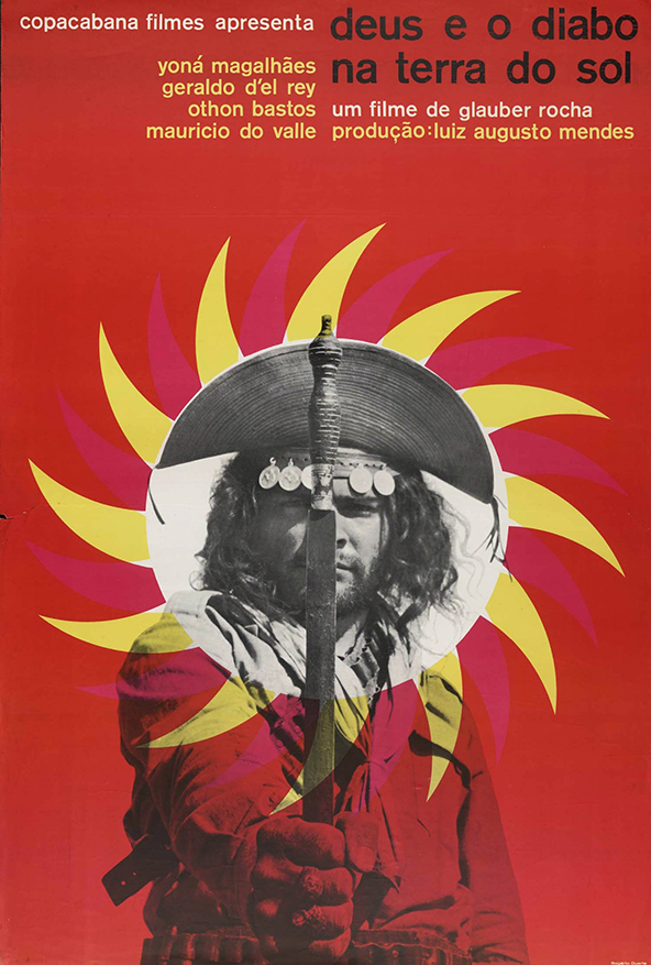
Brazilian Movie Posters
Poster for God and the Devil in the Land of the Sun, 1964 I truly love movies and movie posters. Currently Brazilian film is experiencing a kind of renaissance, but it was not always this way. In this post I’d like to share a series of posters for Brazilian cinema,...
Read More
Typography Deconstructed Letterpress Poster
From Drew Binkley comes the Typography Deconstructed Letterpress Poster, printed by Studio on Fire on 16″ x 24″ Crane Lettra Pearl paper.

My New Favorite Maps
These typographic maps are the real deal. Although typographic maps are not a new idea, few are created manually. Even fewer possess the degree of quality seen here.


Chicago Manual of Style, 16th Edition
In 1906, a small university press in Chicago published its standardized typographical practices.
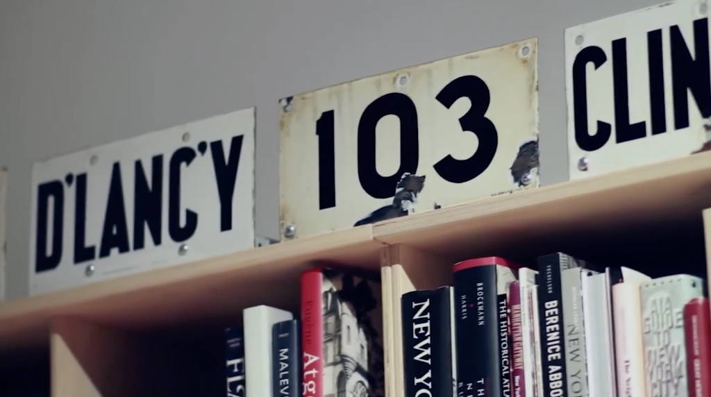
Typographic Train Wrecks
You’re in a store searching for that perfect picture frame. You pick one up that looks good—a simple wood frame with just enough detail to complement your photo.

A Poster for São Paulo
Celebrating the 457th anniversary of São Paulo, the designer Paulo Moretto, along with Alécio Rossi created the exhibit “A Poster for São Paulo”.


Japanese Chocolate Type
On a recent trip to Japan, I found some neat type specimens in the candy aisle at the local supermarket.

Bodoni’s Manuale Tipografico (1818) is Online
A copy of Giambattista Bodoni’s Manuale Tipografico has been photographed and posted by the Rare Book Room.

Monocle Alpino, Anti-iPad Device
Monocle’s Alpino newspaper may be called an experiment, but it’s a successful extension to the Monocle brand—a great variation on a theme.

LH Line1 Sans, Opensource Free Font by Lufthamn Studio
Lufthamn Studio’s opensource (free) sans serif typeface.

Detail in Typography by Jost Hochuli
Hands down, Hyphen Press has the best typeset and thoughtfully bound books on type.

Eastern European Matchbox Labels
Mid-century mass production printing on cardboard has a unique look that’s emulated quite a bit these days.

Jan Tschichold for Penguin Scores, 1949
Oliver Tomas has posted some nice mid-century visual inspiration with his Penguin Book Covers Flickr Collection.

Best Alternative to Helvetica
Font Shop just released a Best Fonts of 2010 list where Bruno Maag’s Aktiv Grotesk is coined the “Best Alternative for Helvetica.”

ZEITtype for Die Zeit by Oleksandr Parkhomovskyy
Oleksandr Parkhomovskyy created this stout white-line blackletter of all caps for Germany’s weekly paper Die Zeit.

Reverting to Type
“It is New North Press’ great pleasure to invite you to our very own typographic extravaganza! Curated by Graham Bignell & Richard Ardagh, Reverting to Type will showcase the work of twenty contemporary letterpress practitioners from around the world, contributions from three leading art colleges and the first eight...
Read More
Beware of the Dogma
“Beware of the Dogma is a booklet for graphic designers wishing to reflect on and question notions of design as a discipline. It explores the theoretical nature of rules and obedience to them using extracts from an interview with a legal philosopher and the theories of Hart and Kemp....
Read More
A Battle of Wills
“A response to the 2010 International Society of Typographic Designers’ ‘Imbalance’ brief. A Battle of Wills explores tensions between the government and British citizens. The book was awarded a merit and also is shortlisted for the British Book Design & Production Awards 2010.”

Dala Floda by Paul Barnes
Dala Floda started out in 2005 as a headline typeface for Frieze Magazine. It has since grown and is now available as a full-featured family of 12 styles.

8 Faces by Elliot Jay Stocks
“Printed on heavy stock, with a foil-blocked cover, and pressed at just 2500 limited editions, each issue is a true collector’s item. 8 Faces will be more at home on your bookshelf than in your magazine rack. Who said print is dead?”
Hand Drawn Type
Most people are surprised to find how much type isn’t set with fonts on the computer but hand drawn. This is usually the case with most old signs and billboards, made when type didn’t exist or just wasn’t easily accessible. Typography Served has posted a few nice examples of...
Read More
CNN en Español Gets a Tilde
Having done work at CNN and other Turner properties, this excellent new ID for CNN en Español jumped out for us. It’s close to home for those in Atlanta.


Are you a … Type Snob!?
Type Snob, call for entries. To earn this distinguished title submit your work in this year’s Type Directors Club competitions.


Sheffield Honey Company Identity by DED Associates
The Sheffield Honey Company Brand by DED Associates (via Brand New)


1862 Cyrillic Type Specimen at Google Books
Maxim Zhukov has unearthed an 1862 Cyrillic type specimen at Google Books.

Nijhof & Lee: Amsterdam’s Best Bookstore
No graphic designer or typophile should miss a trip to Nijhof & Lee.


New York: Inaugural Exhibition at the Newly Re-located Herb Lubalin Study Center of Design and Typography
On view at Cooper Union’s new gallery, an installation that includes recent posters, publications, and motion graphics by internationally recognized graphic designers that spotlight an emerging trend toward expressive lettering and typography.
WANTED: Graphic Designers + a Ruby or Python Programmer
I’m searching for talent to fill five positions: (1) a full time graphic designer (web & print), (2) a contract or freelance graphic designer (web & print), (3) a contract or freelance package designer, (4) a free agent graphic designer (web & mobile), and (5) a free agent Ruby...
Read MoreTypography is Fashion on the Street at Selectism
If you’re in the neighborhood, check out my new column at Selectism.
The Faces Behind Typeradio
Type Radio is a periodic podcast of interviews with typographic experts.
Herb Lubalin Archives at Cooper Union
See some of Herb Lubalin’s work at Justin Thomas Kay’s photo collection of the Herb Lubalin archives at Cooper Union.
I’m Combining Subscription Lists for my Book (The Typographic Desk Reference) and Type Desk
Due to the growing complexity of managing multiple subscription lists, I’ve decided to combine the lists for my book (The Typographic Desk Reference) and Type Desk…
TDRme Deadline Extended to 7/31 [Ugly Typography]
The TDRme contest to win a signed copy of The Typographic Desk Reference has been extended to Friday July 31st.
The Work of Fiodor Sumkin
Russian born illustrator Fiodor Sumkin makes great satirical drawings incorporating some nice hand lettering.
Typekit Gets A Round
San Francisco, Calif. — June 24, 2009 — Small Batch Inc. announced today that they have secured a round of equity funding from a group of investors led by San Francisco-based True Ventures. Small Batch is developing Typekit, a service enabling designers to build sites with web-native typography.
Paul Mijksenaar’s Wayfinding Design
Short video interview with Paul Mijksenaar on wayfinding design…
Paul Mijksenaar’s Wayfinding Design
Short video interview with Paul Mijksenaar on wayfinding design…
Practical Instructions of The Iliad
While your classic literature reads like stereo instructions, keep in mind e‑books won’t always be like this…
Slide Projectors & Intuition
David Carson might drive the gridnicks mad, but you can’t deny his ability to provoke a visceral response. Carson’s work in the early 90s tore a hole in graphic design. His typography, piled in broken heaps, managed to breath life into stodgy corporate communications. His work may look haphazard at...
Read MoreSlide Projectors & Intuition
David Carson might drive the gridnicks mad, but you can’t deny his ability to provoke a visceral response. Carson’s work in the early 90s tore a hole in graphic design. His typography, piled in broken heaps, managed to breath life into stodgy corporate communications. His work may look haphazard at...
Read More