

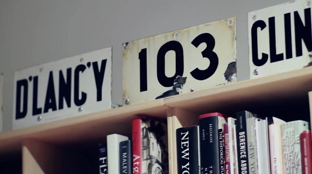
Grafica Della Strada, The Signs Of Italy
It starts with a 16 year old Louise Fili traveling to Italy, stepping off the plane, and falling in love with a billboard. That moment marked the start of Fili’s typographic obsession, and budding career in graphic design. (more…)
Fonts of the Homeless
Typefaces based on the handwriting of homeless people in Barcelona. All proceeds go to the Arrels Foundation, an organization for the benefit of Barcelona’s homeless.


The typographic work of Alex Fowkes for Sony Music
Alex Fowkes designed this great mural of Sony Music’s history, illustrated with mostly type.

The Old Printing Office
The Old Printing Office by Frank Luther Mott is an account of Mott as a printer’s devil for his father’s small town weekly papers in Iowa.

Book Life
It is amazing just how much text exists on the internet. More amazing still is the sheer amount of text that is unavailable.
Inside the office of Hoefler & Frere-Jones
A highlight of 2013, this video was part to a presentation of the AIGA 2013 Medal awards for which Jonathan Hoefler and Tobias Frere-Jones were awarded.


The British Library’s 60,000-Book iPad App
Charleston, SC & London, UK — BiblioLabs, LLC and the British Library are proud to announce their British Library 19th Century Historical Collection App for iPad is now available on the App Store.
Wanted: 25 Graphic Designers
We need 25 contract/freelance designers for a short project with Agfa.

The Blue Lady’s New Look
From JKR, the Camden based packaging design agency, comes an intriguing collection of marketing and branding quips titled “The Blue Lady’s New Look and Other Curiosities: Posts from the Crossroads of Design and Marketing.”

John Fuller’s Sycamore Press
Ryan Roberts, purveyor of the official websites for Julian Barnes, Ian McEwan, James Fenton, Hermione Lee, and Ian Hamilton, has authored “John Fuller and the Sycamore Press: a bibliographic history.”

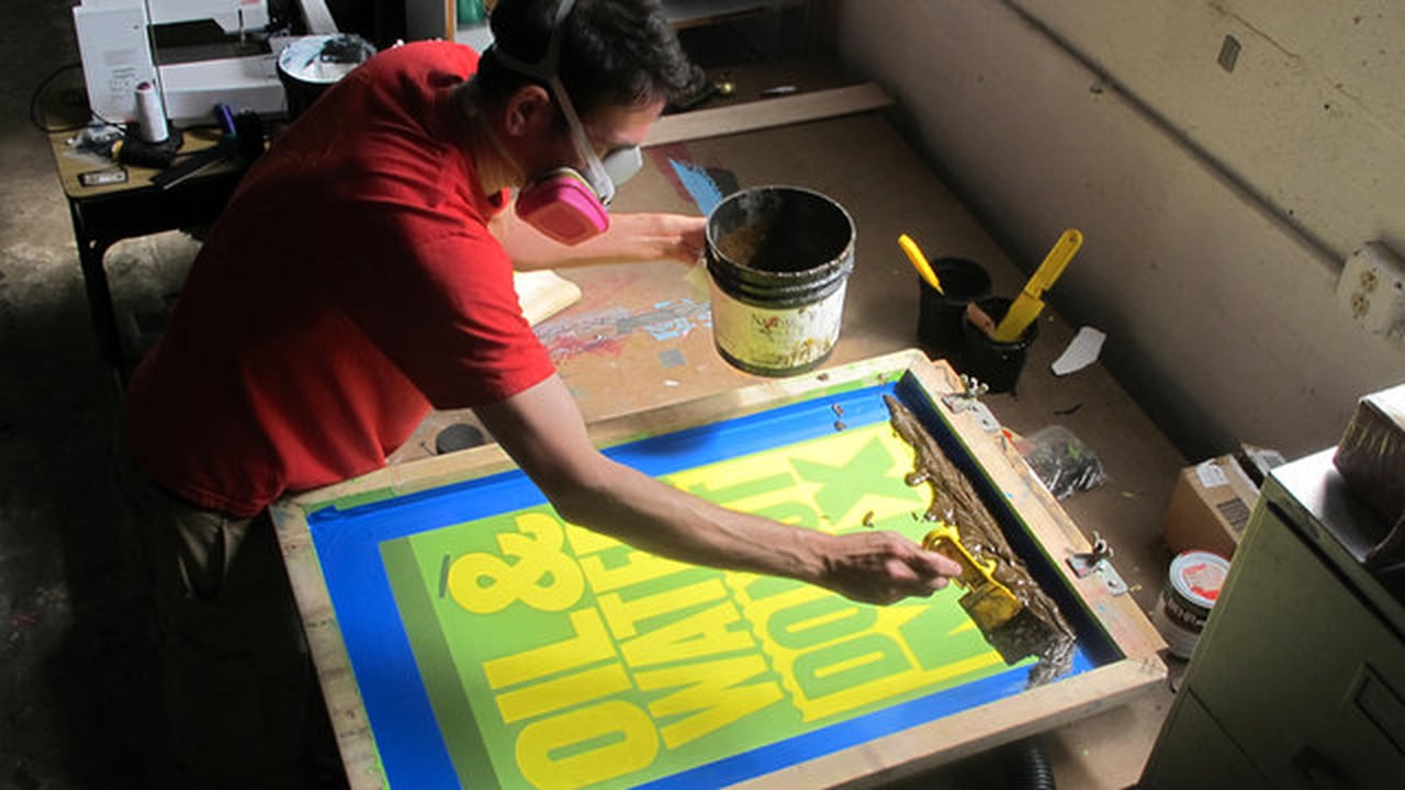
Typography Deconstructed Letterpress Poster
From Drew Binkley comes the Typography Deconstructed Letterpress Poster, printed by Studio on Fire on 16″ x 24″ Crane Lettra Pearl paper.

John Rodker’s Ovid Press
Gerald W. Cloud, author of John Rodker’s Ovid Press: A Bibliographical History, is an investigator with a bent for narrative writing about books.

Bodoni’s Manuale Tipografico (1818) is Online
A copy of Giambattista Bodoni’s Manuale Tipografico has been photographed and posted by the Rare Book Room.

Monocle Alpino, Anti-iPad Device
Monocle’s Alpino newspaper may be called an experiment, but it’s a successful extension to the Monocle brand—a great variation on a theme.


LH Line1 Sans, Opensource Free Font by Lufthamn Studio
Lufthamn Studio’s opensource (free) sans serif typeface.


Detail in Typography by Jost Hochuli
Hands down, Hyphen Press has the best typeset and thoughtfully bound books on type.

Eastern European Matchbox Labels
Mid-century mass production printing on cardboard has a unique look that’s emulated quite a bit these days.

Jan Tschichold for Penguin Scores, 1949
Oliver Tomas has posted some nice mid-century visual inspiration with his Penguin Book Covers Flickr Collection.

Sensaway by Áron Jancsó
It’s rare to see a typeface with such confidence, perhaps in itself and in the reader.

A Magazine Designer’s Guide to Designing Magazines
Every shipment of Stack America comes with an exclusive magazine-themed print.

Best Alternative to Helvetica
Font Shop just released a Best Fonts of 2010 list where Bruno Maag’s Aktiv Grotesk is coined the “Best Alternative for Helvetica.”

On Maps Made of Words and Automated Design
Aegir Hallmunder on typographic maps and wether automated design is good or bad.

ZEITtype for Die Zeit by Oleksandr Parkhomovskyy
Oleksandr Parkhomovskyy created this stout white-line blackletter of all caps for Germany’s weekly paper Die Zeit.

Bracket
“Bracket is a conceived as a publication that features everything in between — ideas, voices and processes that are overlooked and under-appreciated.”
Refracted Alphabet
“A follow up refraction experiment featuring the Alphabet spoken by the late GREAT Richard Pryor. Mixed with Blockhead’s ‘Coloringbook’.”

Clipper Ship Cards
These vintage clipper cards were advertisements for shipping voyages, usually from a port on the east coast (New York, Boston) to the west coast (San Francisco). They were distributed by ship dispatchers in the 1800s.
5 Year Datebook
“Black covered cover. Removable transparent plastic protective case. A two-page spread for each week. Daily schedule from 8am to 10pm.”
Reinventing the Camera Strap
“Camera slings aren’t new, they’ve just gotten popular in recent years. When we set out to make the Loop, we challenged ourselves to surpass every aspect of existing camera slings and make something better…”

MyFonts’ Creative Characters by Jan Middendorp
Landing on my desk is this great compilation of type designer interviews done by Jan Middendorp for MyFonts entitled Creative Characters.

Reverting to Type
“It is New North Press’ great pleasure to invite you to our very own typographic extravaganza! Curated by Graham Bignell & Richard Ardagh, Reverting to Type will showcase the work of twenty contemporary letterpress practitioners from around the world, contributions from three leading art colleges and the first eight...
Read More
Beware of the Dogma
“Beware of the Dogma is a booklet for graphic designers wishing to reflect on and question notions of design as a discipline. It explores the theoretical nature of rules and obedience to them using extracts from an interview with a legal philosopher and the theories of Hart and Kemp....
Read More
A Battle of Wills
“A response to the 2010 International Society of Typographic Designers’ ‘Imbalance’ brief. A Battle of Wills explores tensions between the government and British citizens. The book was awarded a merit and also is shortlisted for the British Book Design & Production Awards 2010.”

8 Faces by Elliot Jay Stocks
“Printed on heavy stock, with a foil-blocked cover, and pressed at just 2500 limited editions, each issue is a true collector’s item. 8 Faces will be more at home on your bookshelf than in your magazine rack. Who said print is dead?”
Erik Spiekermann on Deutsche Welle TV
On the heels of having won the Federal German Design Prize 2011 Lifetime Achievement Award from the German Design Council, Erik Spiekermann is interviewed by Deutsche Welle TV.

50 Reading Lists for Designers
“Spin/2 – 50 Reading Lists, a paper based on asking major figures in graphic design the question: what are the top ten books that you believe designers should read?”

Hart’s Rules for Compositors and Readers
From 1967 and a great resource for info on setting type. An updated version is also available: Hart’s Rules for Compositors and Readers.
Type Desk Welcomes Yoko Sakao Ohama
Yoko joins Type Desk to report from New York on design and logical process. Logical as apposed to illogical. Having worked with Yoko, I guarantee it’s a privilege to experience Yoko’s “logical process.” Welcome aboard Yoko!

René Gruau’s Work for Dior
“Since founding her Munich-based graphic arts gallery, Bartsch & Chariau, in 1980, Joëlle Chariau has been an advocate of René Gruau, writes Liz Farrelly. Across the river from the Design Museum’s Drawing Fashion exhibition (where Chariau discussed fashion illustration), the Embankment Galleries at Somerset House are staging Dior Illustrated:...
Read More
Making Grids with Sigurður Ármannsson’s Easy Grid Calculator
Sigurður Ármannsson explains how to use his Easy Grid Calculator to produce square document grid units based on leading.


Capucine by Process Type Foundry
“Although Capucine defies traditional categorization, it sits in a genre we are drawn to as users of type: a face with distinct personality able to straddle the worlds of both text and display with ease. In this context it should come as no surprise that its designer was born...
Read More
Crumpled City Map by Emanuele Pizzolorusso
“It just takes 2 seconds to open and close this innovative soft map.”

The WSJ Hedcuts by Randy Glass
Everyone has seen his work. Master stippler Randy Glass has created hundreds of these hedcut style illustrations for the Wall Street Journal.
Hand Drawn Type
Most people are surprised to find how much type isn’t set with fonts on the computer but hand drawn. This is usually the case with most old signs and billboards, made when type didn’t exist or just wasn’t easily accessible. Typography Served has posted a few nice examples of...
Read MoreThe most-read man in the world—Matthew Carter
“Matthew Carter, a type designer and the recipient of a MacArthur genius grant, was recently approached in the street near his home in Cambridge, Massachusetts. A woman greeted him by name. “Have we met?” Mr Carter asked. No, she said, her daughter had pointed him out when they were...
Read MoreYour copy/paste activities will be tracked
“If you’re a publisher, you want to know what your readers are most interested in–that way you can better target editorial and keep readers coming back. Until now, most publishers have relied on tracking whole pages to discern their readers’ priorities. But a tool from a company called Tynt,...
Read More
The 365 Calendrical Notebook
“365 is a calendrical notebook with serially numbered pages and an A to Z. The latest editions are again thread-stitched and either available with 12 rainbow-coloured papers or with Alster Werkdruck and gold-edging on three sides. Typeset in Poster Bodoni, designed by Greige/Buero fuer Design, printed and bound in...
Read More
Bags from the Past: the Airline Bag Lounge
This is a little old, but it’s still good: the Airline Bag Lounge brought to you by Troyland.
Flight Path Visualizations by Aaron Koblin
“This work was originally developed as a series of experiments for the project “Celestial Mechanics” by colleagues Scott Hessels and Gabriel Dunne at UCLA. FAA data was parsed and plotted using the Processing programming environment. The frames were composited with Adobe After Effects and/or Maya.” —Aaron Koblin, creator of...
Read More
Hans Rosling’s 200 Countries over 200 Years in 4 Minutes
Hans Rosling on BBC Four’s “The Joy of Stats”
Ordering Disorder, Grid Principles for Web Design
This is definitely on my list. Ordering Disorder: Grid Principles for Web Design (Voices That Matter) by Khoi Vinh

Sachsenwald Blackletter
“This typeface was designed by Bertold Wolpe in Germany in the early 1930s and was originally named Bismarck Schrift…”

Morgan Press Wood Type Specimen
Morgan Press printers and typographers Design: John Alcorn Author: Morgan Press Published: Hastings-on-Hudson, NY: Morgan Press, [1964?]

CNN en Español Gets a Tilde
Having done work at CNN and other Turner properties, this excellent new ID for CNN en Español jumped out for us. It’s close to home for those in Atlanta.

Jonathan Safran Foer’s Unmakeable Book
“Book printers said the award winning author’s design “could not be made.” Belgian publishing house Die Keure proved them wrong.”


Flowers + Newsprint, Beautiful
“Fresh Flowers is a collection of flowers, it’s a different newspaper, it’s a way of having flowers on your table everyday.”

Supergraphics from Unit Editions
Supergraphics just arrive at my desk. Unit Editions has a knack for superlative documentation of creative objects…

Businesspeople Need to Become Designers
“Roger Martin, Dean of the Rotman School of Management at the University of Toronto, tells us how businesspeople need to become designers–designing user experiences and business models–to create something new and fantastic, and not just analyze the past.”
The Story Behind Angry Paul Rand
“Over three months in the Summer of 2010, in addition to my normal Twitter account @mgoldst, I had a Twitter account by the name of @AngryPaulRand. Like every designer I have ever met, I had some things I had always wanted to say, and using Paul Rand as a...
Read More
Copenhagen Wall Calendar by Urbncal
“urbnCal 2011 Copenhagen has a graphic look with black and white photographs and red colour (pms 206) in twelve different shades. The calendar is photographed in different areas of Copenhagen, one area per month, starting from the center and out in a clockwise motion.”

Gary Anderson, Designer of ♻
“It has been called one of America’s “most important design icons,” it is one of the most recognizable graphic symbols in the world and has helped to encourage global recycling. In some countries, such as the UK, the symbol carries such implicit meaning that it requires government permission to...
Read More

Mafra Display by Pedro Leal
Mafra was published by dstype in 2010. Soon to be available at MyFonts and other places.

Ladies and Gentlemen, the Paper Sack
The invention and improvement of the modern paper bag, because who doesn’t like a good paper sack?

Prison Tattoos of Danzig Baldaev
Rick Poynor on the Russian prison tattoo flash art of Danzig Baldaev on show in London along with photographs of tattooed prisoners by Sergei Vasiliev.

The Ames Lettering Contraption
“Oh, bedeviling Ames Guide! How curious your strange shape, your myriad holes filled with murk and mystery. What–what??–are you for??”

Graphic Design and Your Soul
Dan Reynolds’ review of the second edition of Adrian Shaughnessy‘s How to be a graphic designer without losing your soul.

A 2011 Calendar with Rhythm by NEWWORK
“By composing dates as music notes, simply hoping the calendar could give viewers a smile in 2011. The calendar is silk screened on large ( 26″ x 40″) and thick weight stone henge paper which is very gorgeous.” Available for $48 from NEWWORK. Via Selectism

Paris vs New York, A Graphic Tally
“A visual but friendly match between those two cities seen by a lover of Paris wandering through New York’s infinite details, clichés and contradictions”

Nice Job, Robb—The “the” Project
“Wordmarks from a private stock of predigital lettering scoured from low resolution archives, personally converted to bezier outlines by Robb for use by today’s graphic designers who appreciate the wonky shapes of yesteryear.”
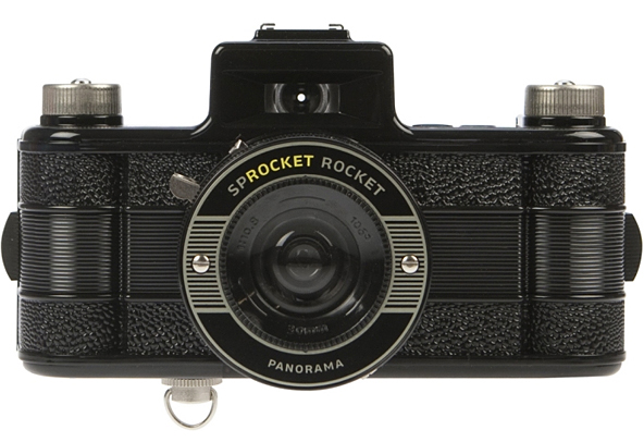
Lomography Sprocket Rocket
Forget full-frame censors. Images from the Sprocket Rocket include the film gears.

Colophon’s Aperçu
Brighton based designers Anthony Sheret and Edd Harrington have recently launched their specimen catalogue to accompany the release of Aperçu, the latest font to come out of their font foundry, Colophon.


Are you a … Type Snob!?
Type Snob, call for entries. To earn this distinguished title submit your work in this year’s Type Directors Club competitions.

Leica M9 ‘Titanium’ Designed By Walter De’silva
Selectism: Leica M9 ‘Titanium’ Designed By Walter De’silva


Selfridges Tea Packaging by Noreen Khan & Lewis Moberly
Selfridges Tea Packaging by Noreen Khan & Lewis Moberly (at Lovely Package)


Sheffield Honey Company Identity by DED Associates
The Sheffield Honey Company Brand by DED Associates (via Brand New)

Alain de Botton at Herman Miller’s Lifework
Alain de Botton interviewed at Herman Miller’s Lifework Blog


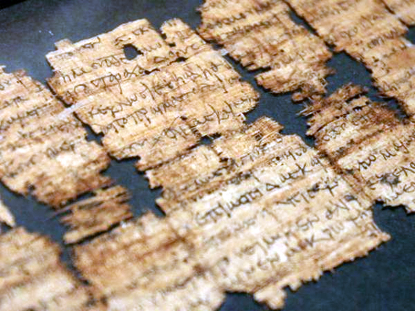
1862 Cyrillic Type Specimen at Google Books
Maxim Zhukov has unearthed an 1862 Cyrillic type specimen at Google Books.

The Office of 37 Signals
Alissa Walker reports for Fast Company on the new office of the company that brought us Basecamp.

Project C‑90 Audio Cassette Image Archive
“… This page is dedicated to cassette tapes… Here you won’t find any kind of scientific research, technical data or things like that…”
W’s new W
In response to declining circulation figures, Condé Nast hired Stefano Tonchi. Tonchi’s first task was to relaunch the magazine, and the logical starting point was the masthead.

